Dashboard components
Build-a-Dashboard Workshop
2024-08-12
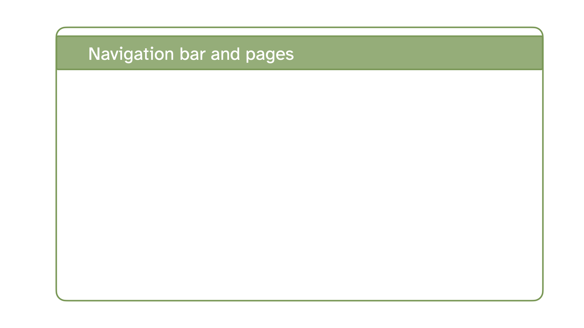
Navigation bar and pages
Icon, title, and author along with links to sub-pages if more than one page is defined.
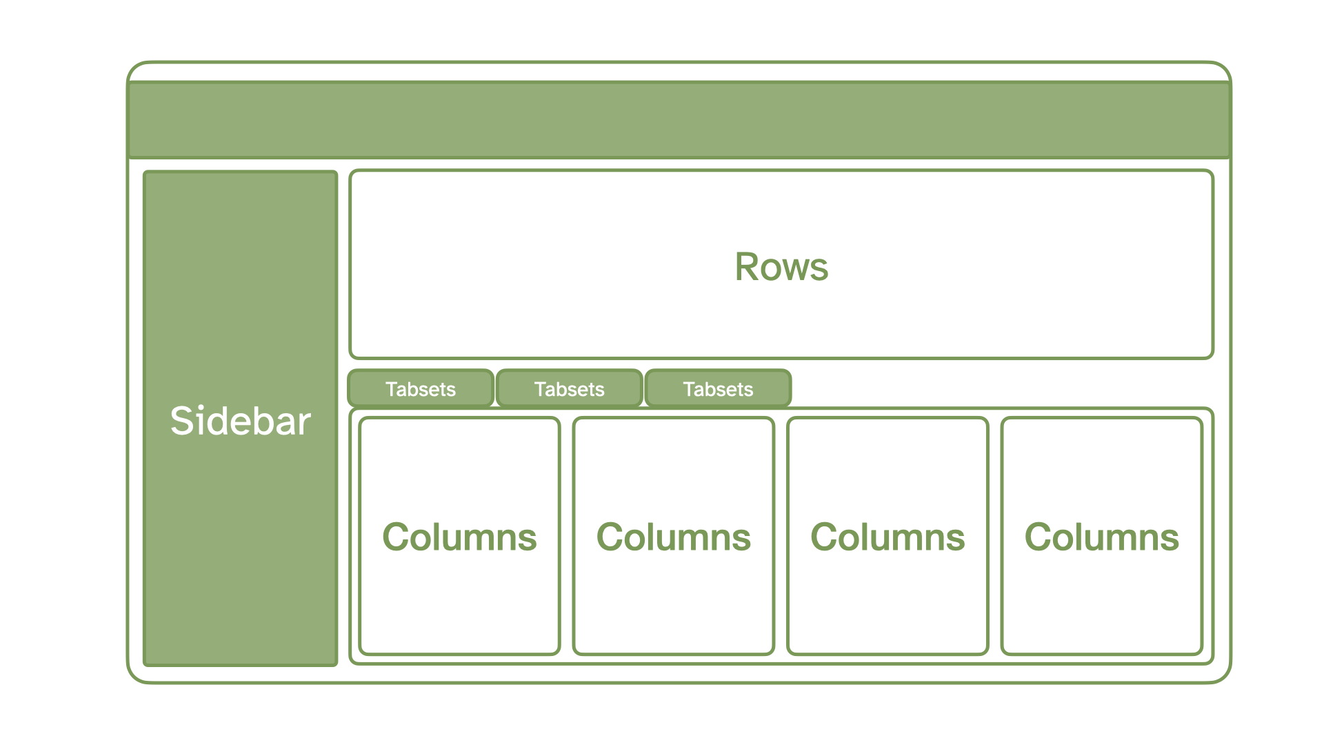
Sidebars, rows, columns, and tabsets
Rows and columns using markdown heading, with optional attributes to control height, width, etc. Sidebars, mostly used for for interactive inputs. Tabsets to further divide content.
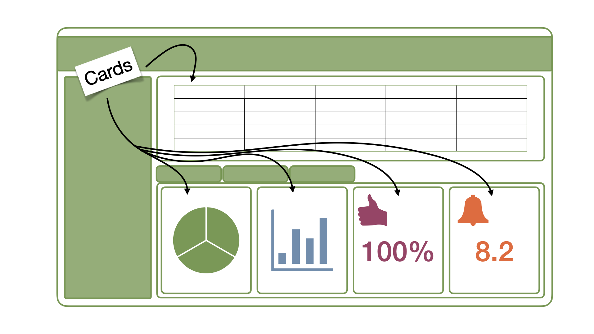
Cards
Cards are containers for code cell outputs (e.g., plots, tables, value boxes) and free form markdown text. The content of cards typically maps to cells in your notebook or source document.
Pages
Pages
Logo
Navigation buttons
dashboard-r.qmd
---
title: "Navigation buttons"
format:
dashboard:
logo: images/beetle.png
nav-buttons:
- icon: github
href: https://github.com/quarto-dev/quarto-cli
aria-label: GitHub
- icon: linkedin
href: https://www.linkedin.com/company/posit-software/
aria-label: LinkedIn
- icon: youtube
href: https://youtube.com/
aria-label: YouTube
---
```{r}
library(ggplot2)
```
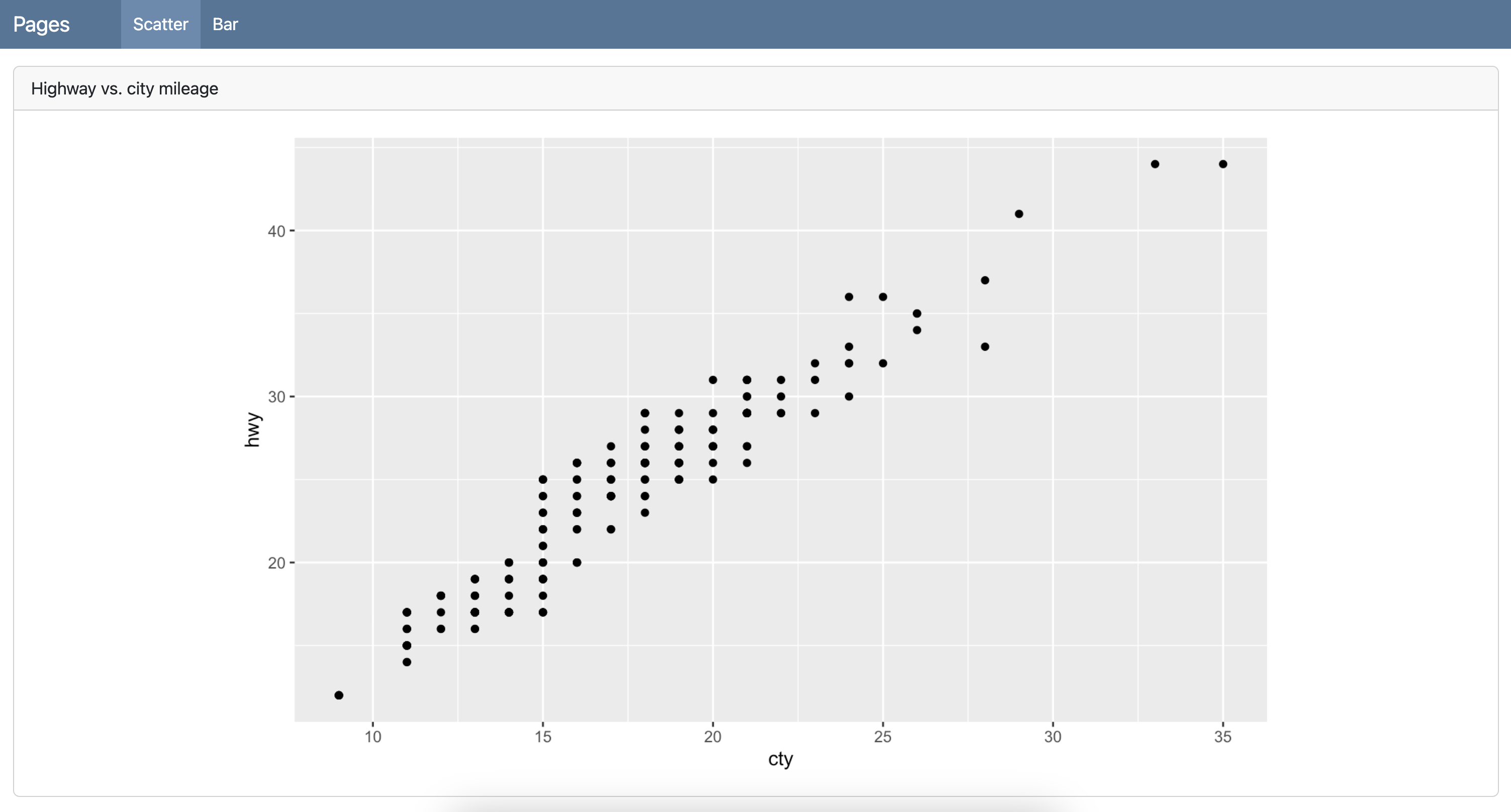
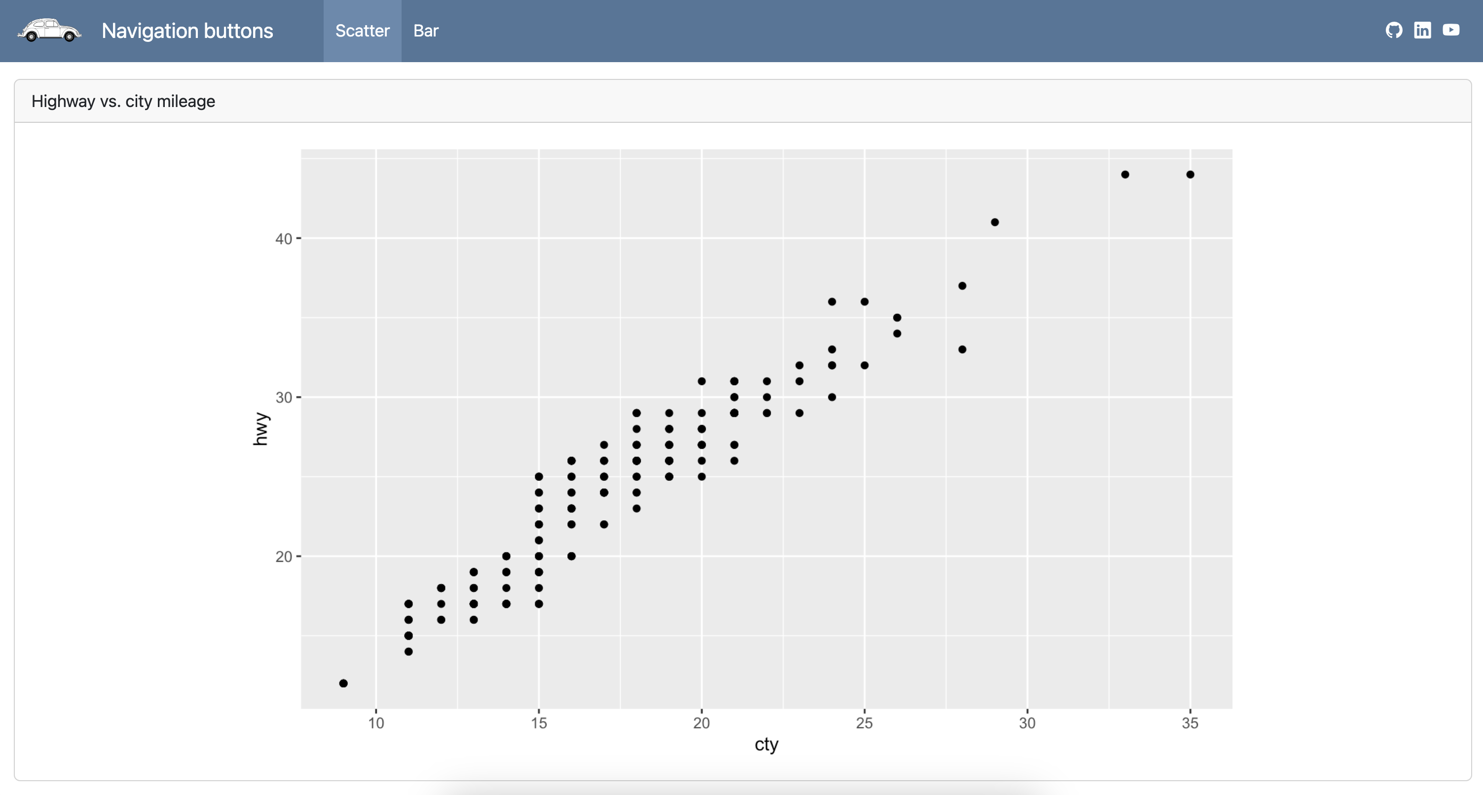
# Scatter
```{r}
#| title: Highway vs. city mileage
ggplot(mpg, aes(x = cty, y = hwy)) +
geom_point()
```
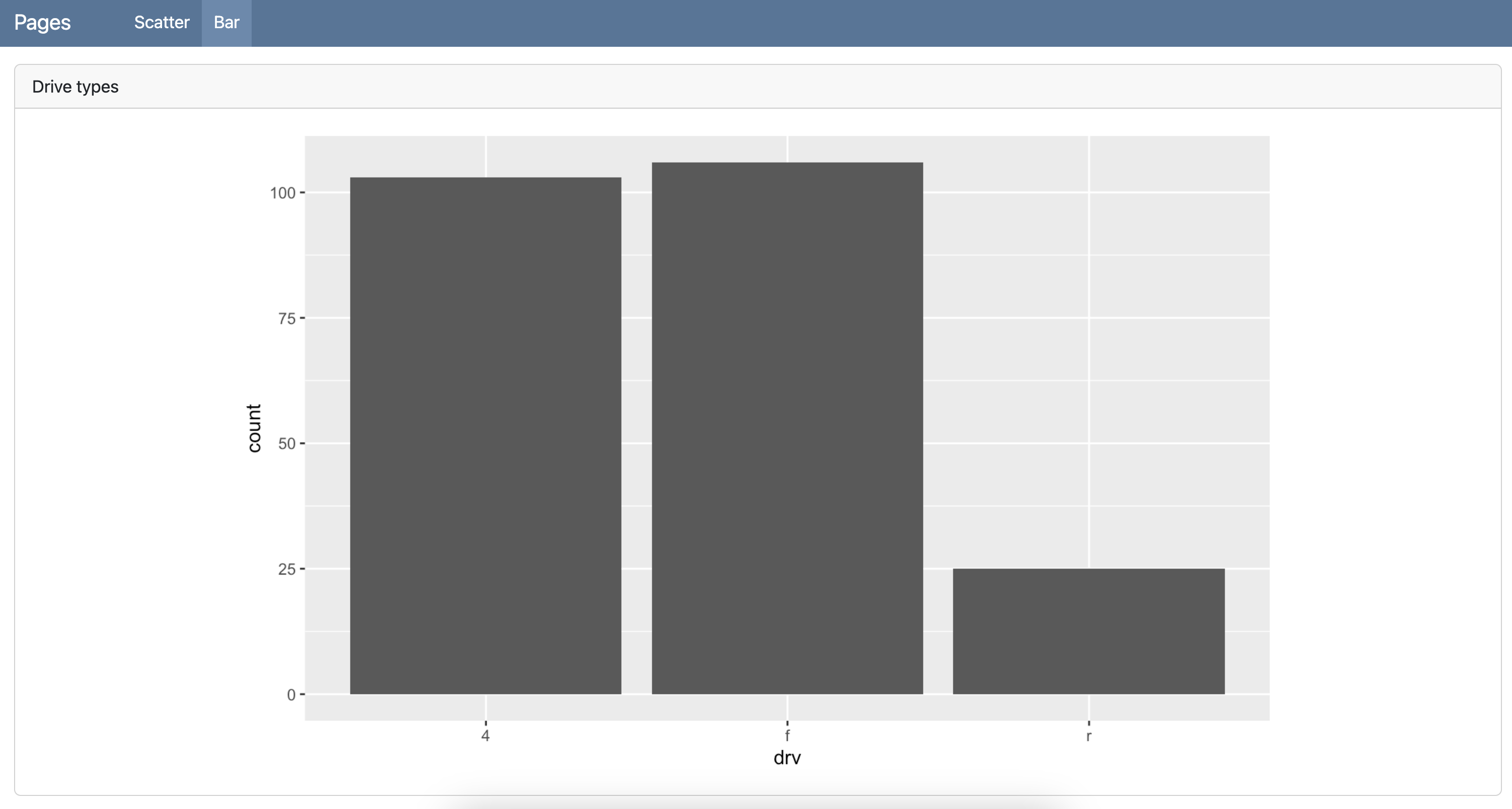
# Bar
```{r}
#| title: Drive types
ggplot(mpg, aes(x = drv)) +
geom_bar()
```
Sidebars - Global
dashboard-r.qmd
---
title: "Sidebars - Global"
format:
dashboard:
logo: images/beetle.png
nav-buttons:
- icon: github
href: https://github.com/quarto-dev/quarto-cli
aria-label: GitHub
- icon: linkedin
href: https://www.linkedin.com/company/posit-software/
aria-label: LinkedIn
- icon: youtube
href: https://youtube.com/
aria-label: YouTube
---
```{r}
library(ggplot2)
```
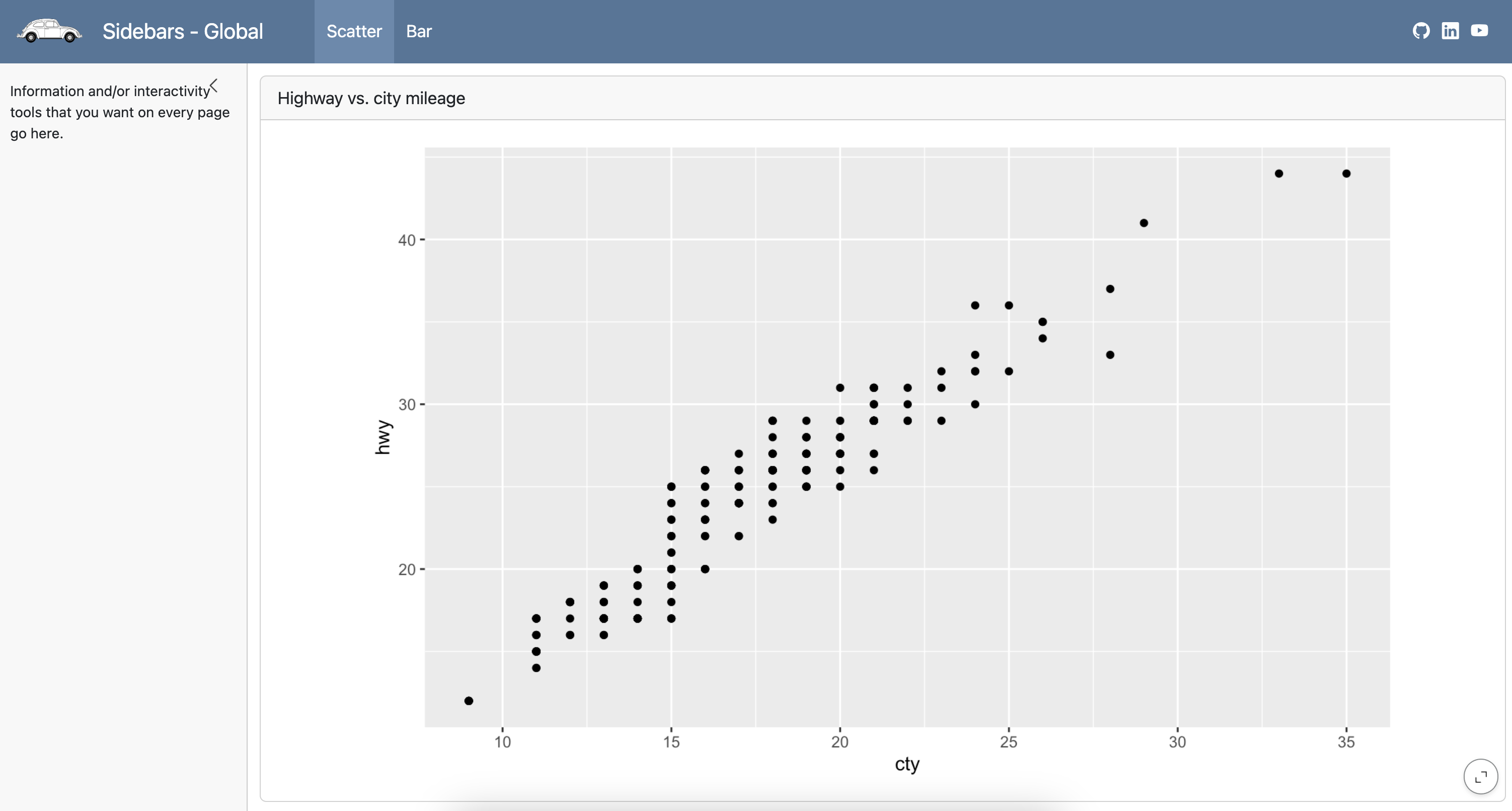
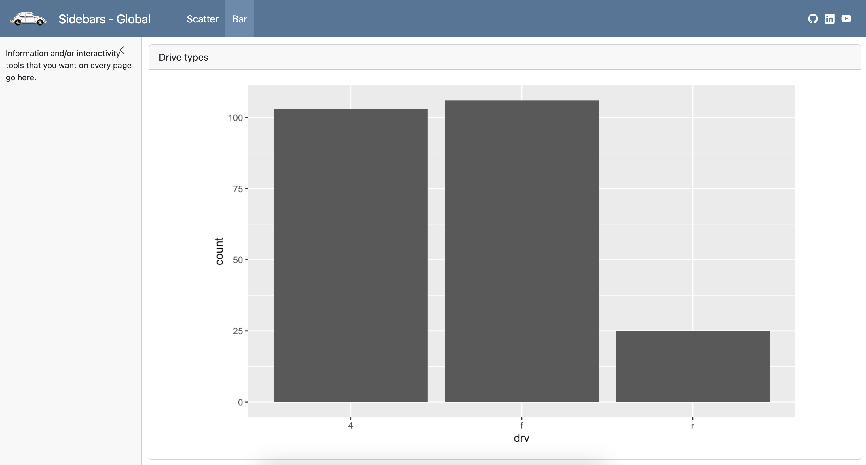
# {.sidebar}
Information and/or interactivity tools that you want on every page go here.
# Scatter
```{r}
#| title: Highway vs. city mileage
ggplot(mpg, aes(x = cty, y = hwy)) +
geom_point()
```
# Bar
```{r}
#| title: Drive types
ggplot(mpg, aes(x = drv)) +
geom_bar()
```
Sidebars - Global
dashboard-r.qmd
---
title: "Sidebars - Global"
format:
  dashboard:
    logo: images/beetle.png
    nav-buttons:
      - icon: github
        href: https://github.com/quarto-dev/quarto-cli
        aria-label: GitHub
      - icon: linkedin
        href: https://www.linkedin.com/company/posit-software/
        aria-label: LinkedIn
      - icon: youtube
        href: https://youtube.com/
        aria-label: YouTube
---

```{r}
library(ggplot2)
```

# {.sidebar}

Information and/or interactivity tools that you want on every page go here.

# Scatter

```{r}
#| title: Highway vs. city mileage
ggplot(mpg, aes(x = cty, y = hwy)) +
  geom_point()
```

# Bar

```{r}
#| title: Drive types
ggplot(mpg, aes(x = drv)) +
  geom_bar()
```
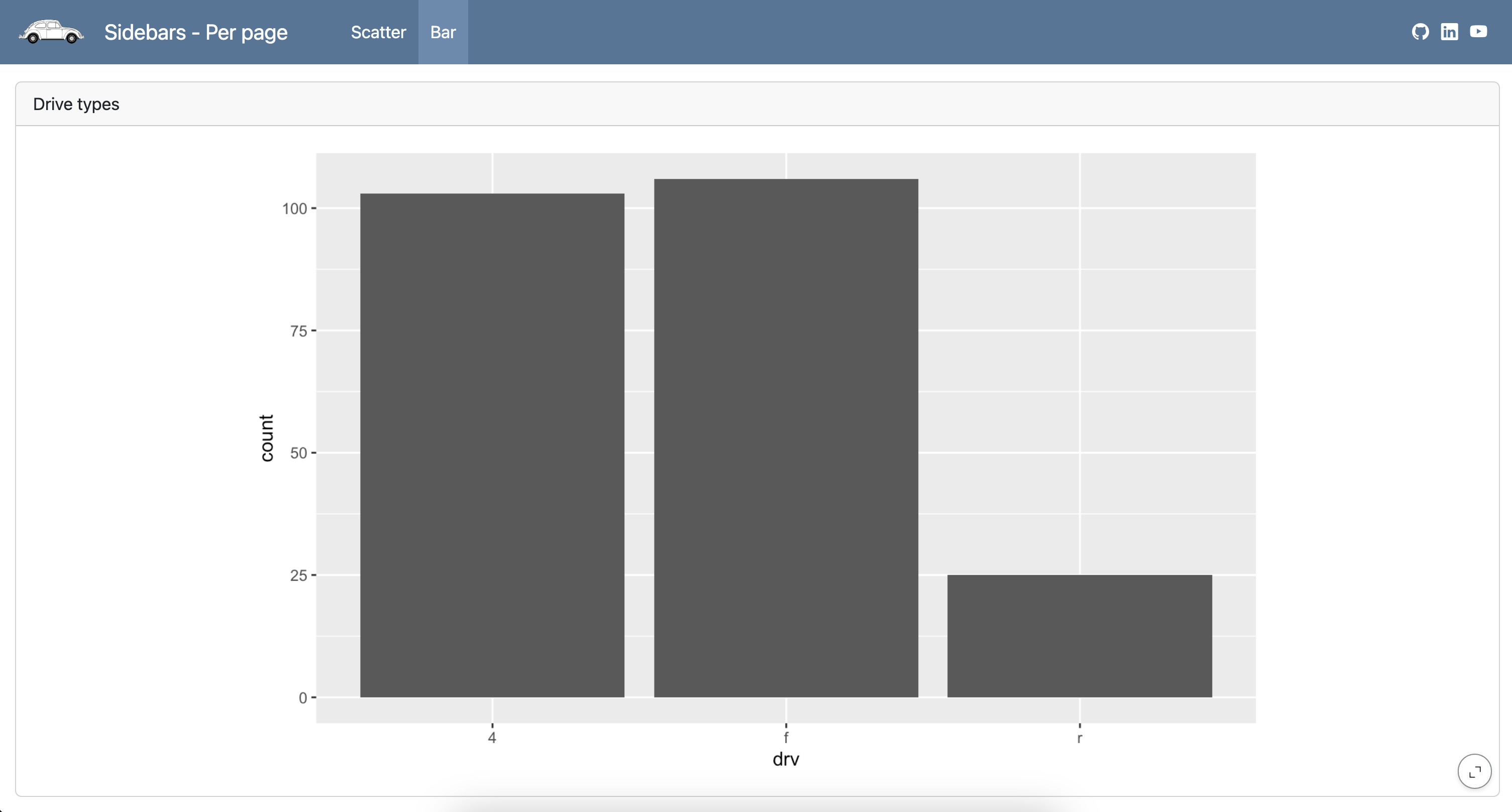
Sidebars - Page
dashboard-r.qmd
---
title: "Sidebars - Per page"
format:
  dashboard:
    logo: images/beetle.png
    nav-buttons:
      - icon: github
        href: https://github.com/quarto-dev/quarto-cli
        aria-label: GitHub
      - icon: linkedin
        href: https://www.linkedin.com/company/posit-software/
        aria-label: LinkedIn
      - icon: youtube
        href: https://youtube.com/
        aria-label: YouTube
---

```{r}
library(ggplot2)
```

# Scatter

## {.sidebar}

Information and/or interactivity tools that you want on a single page go here.

##

```{r}
#| title: Highway vs. city mileage
ggplot(mpg, aes(x = cty, y = hwy)) +
  geom_point()
```

# Bar

```{r}
#| title: Drive types
ggplot(mpg, aes(x = drv)) +
  geom_bar()
```
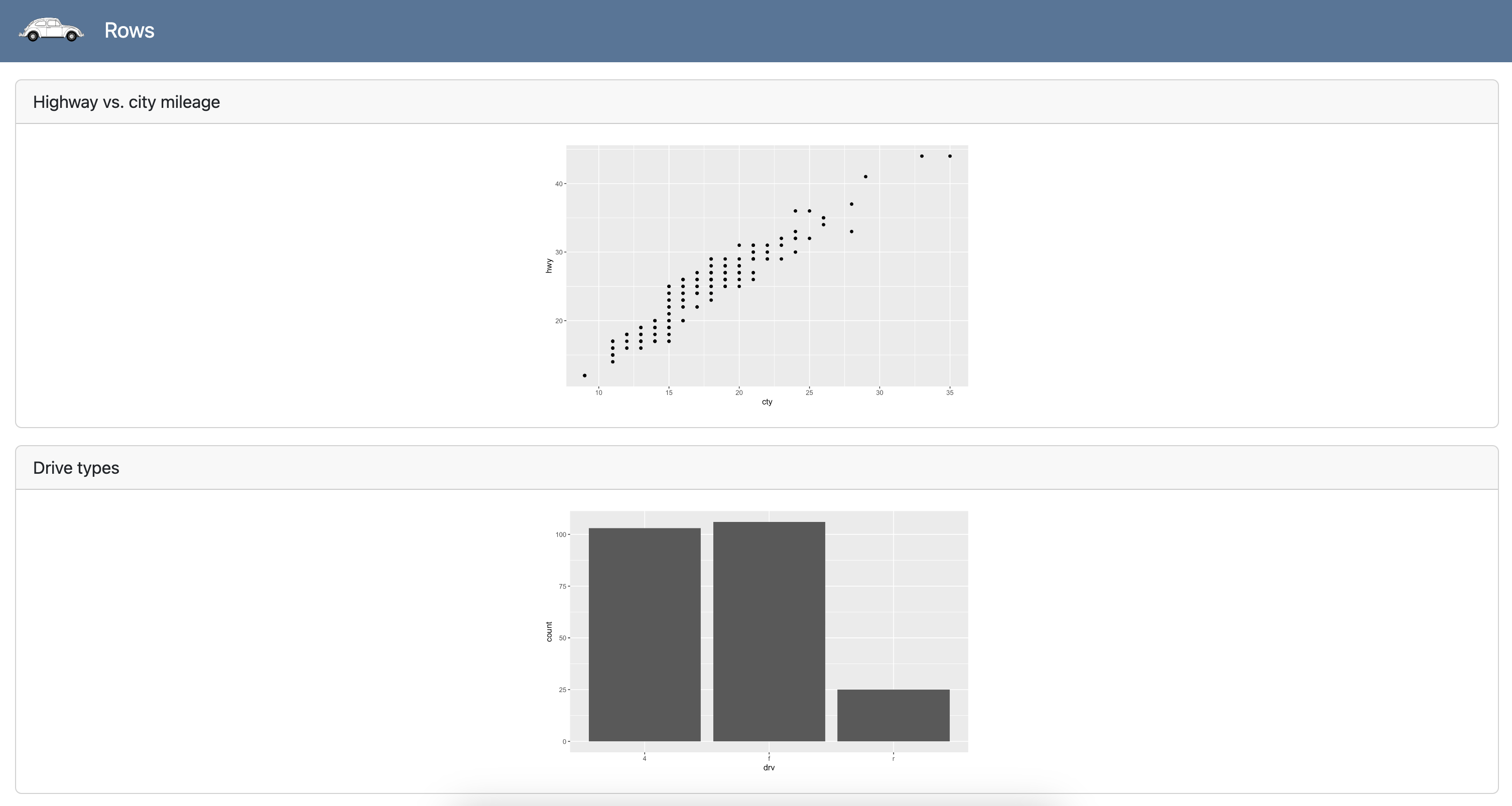
Rows
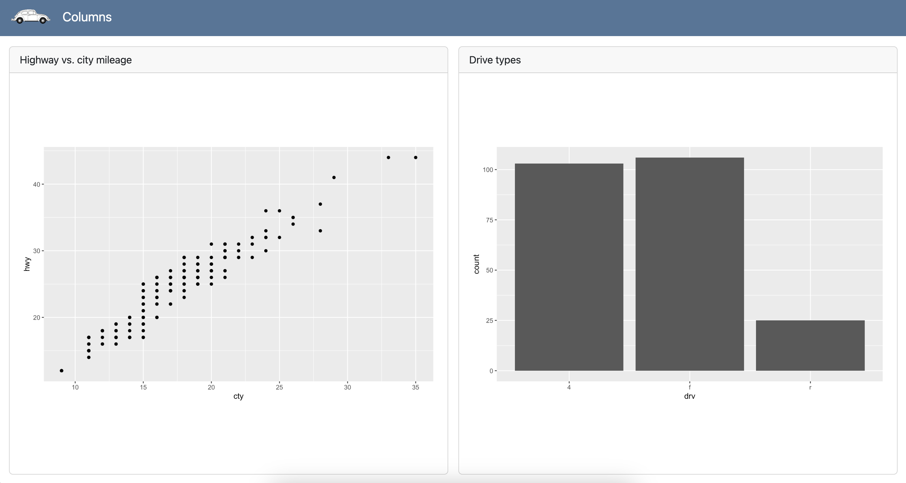
Columns
dashboard-r.qmd
---
title: "Columns"
format:
  dashboard:
    orientation: columns
    logo: images/beetle.png
---

```{r}
library(ggplot2)
```

## Scatter

```{r}
#| title: Highway vs. city mileage
ggplot(mpg, aes(x = cty, y = hwy)) +
  geom_point()
```

## Bar

```{r}
#| title: Drive types
ggplot(mpg, aes(x = drv)) +
  geom_bar()
```
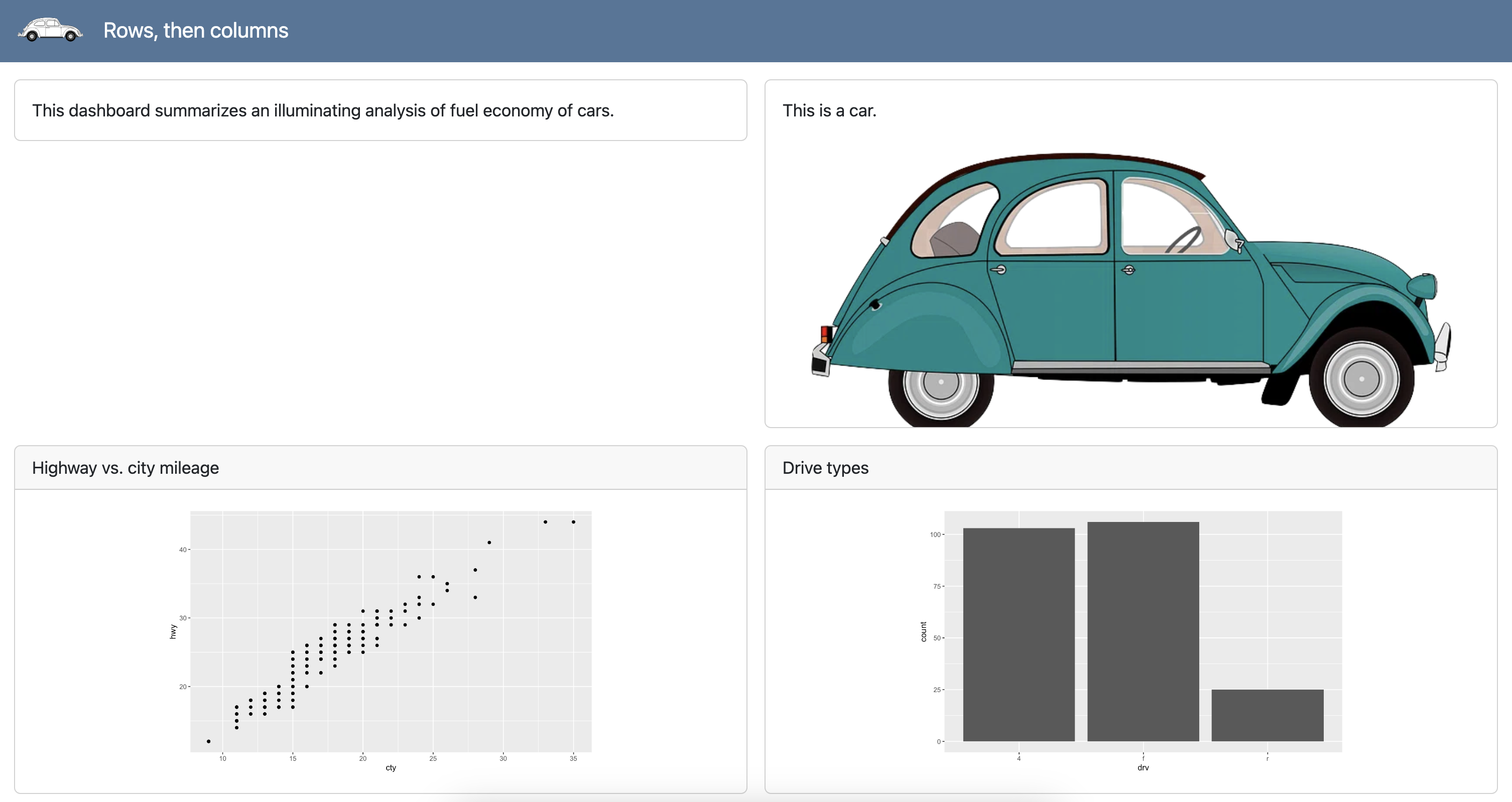
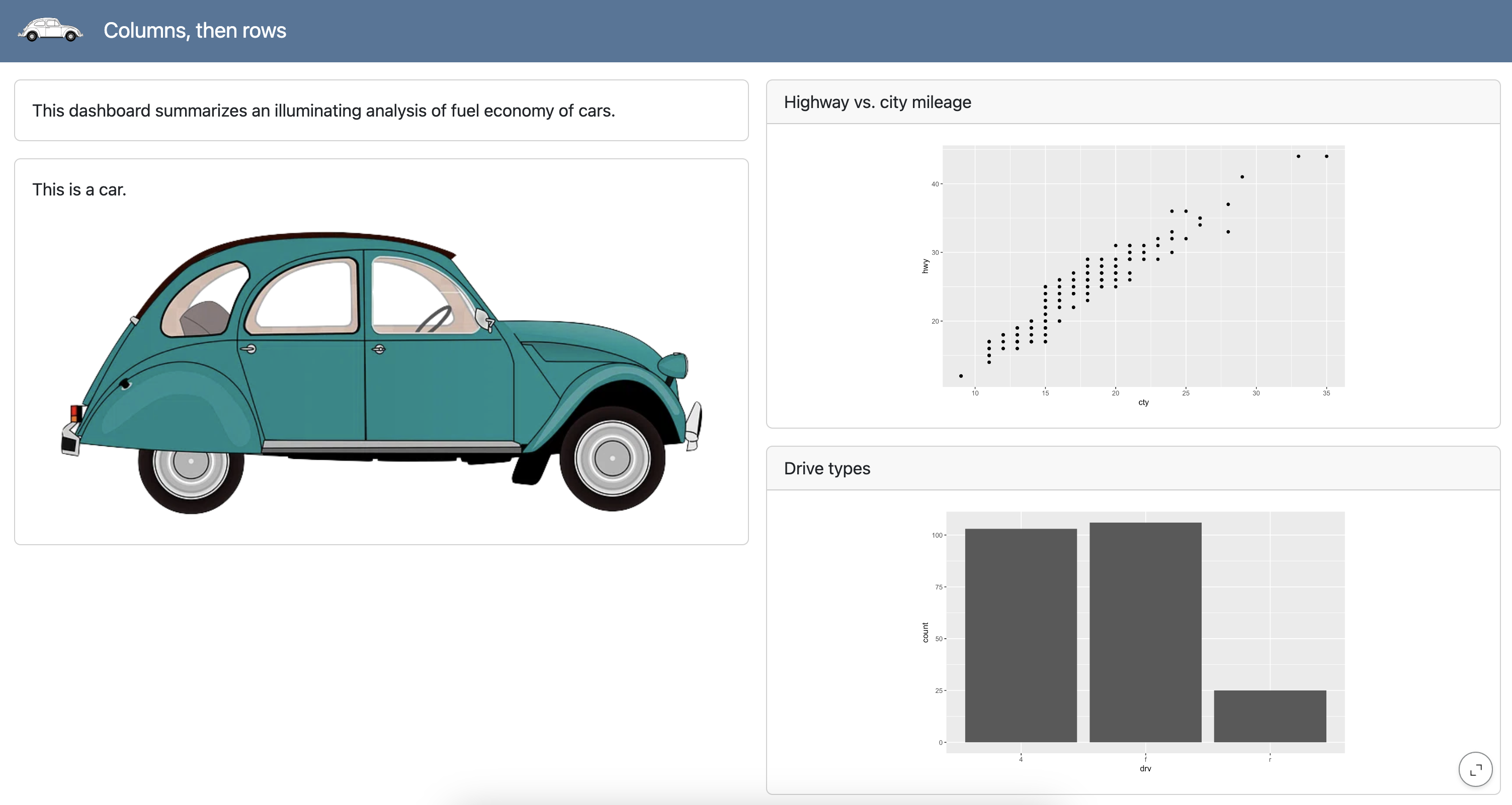
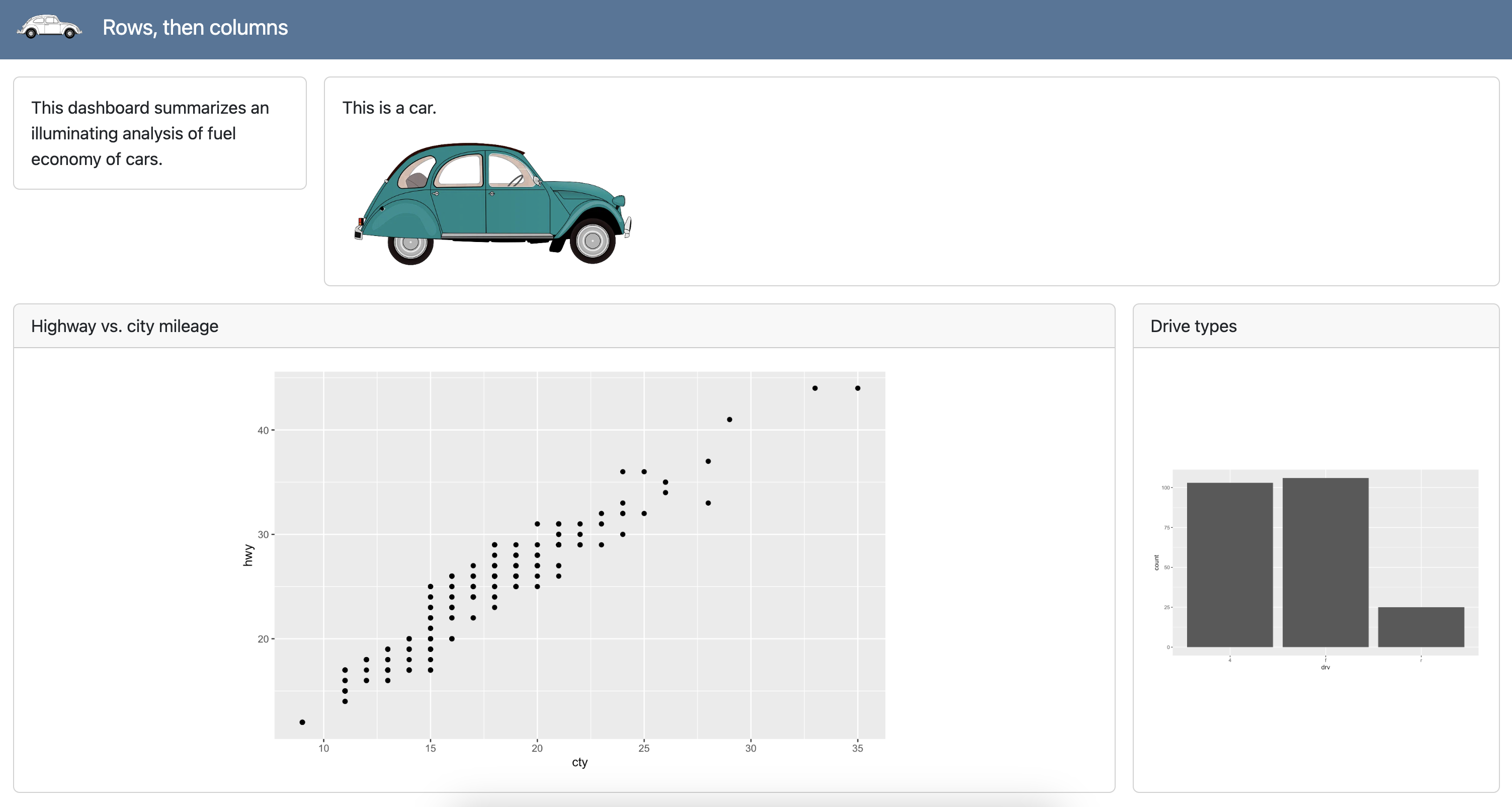
Rows, then columns
dashboard-r.qmd
---
title: "Rows, then columns"
format:
dashboard:
logo: images/beetle.png
---
```{r}
library(ggplot2)
```
## Overview
###
This dashboard summarizes an illuminating analysis of fuel economy of cars.
###
This is a car.
{fig-alt="Illustration of a teal color car."}
## Plots
### Scatter
```{r}
#| title: Highway vs. city mileage
ggplot(mpg, aes(x = cty, y = hwy)) +
geom_point()
```
### Bar
```{r}
#| title: Drive types
ggplot(mpg, aes(x = drv)) +
geom_bar()
```
Columns, then rows
dashboard-r.qmd
---
title: "Rows, then columns"
format:
dashboard:
orientation: columns
logo: images/beetle.png
---
```{r}
library(ggplot2)
```
## Overview
###
This dashboard summarizes an illuminating analysis of fuel economy of cars.
###
This is a car.
{fig-alt="Illustration of a teal color car."}
## Plots
### Scatter
```{r}
#| title: Highway vs. city mileage
ggplot(mpg, aes(x = cty, y = hwy)) +
geom_point()
```
### Bar
```{r}
#| title: Drive types
ggplot(mpg, aes(x = drv)) +
geom_bar()
```
Heights and widths of rows and columns
dashboard-r.qmd
---
title: "Rows, then columns"
format:
dashboard:
logo: images/beetle.png
---
```{r}
library(ggplot2)
```
## Overview {height="30%"}
### {width="20%"}
This dashboard summarizes an illuminating analysis of fuel economy of cars.
### {width="80%"}
This is a car.
{fig-alt="Illustration of a teal color car." width="300"}
## Plots {height="70%"}
### Scatter {width="75%"}
```{r}
#| title: Highway vs. city mileage
ggplot(mpg, aes(x = cty, y = hwy)) +
geom_point()
```
### Bar {width="25%"}
```{r}
#| title: Drive types
ggplot(mpg, aes(x = drv)) +
geom_bar()
```
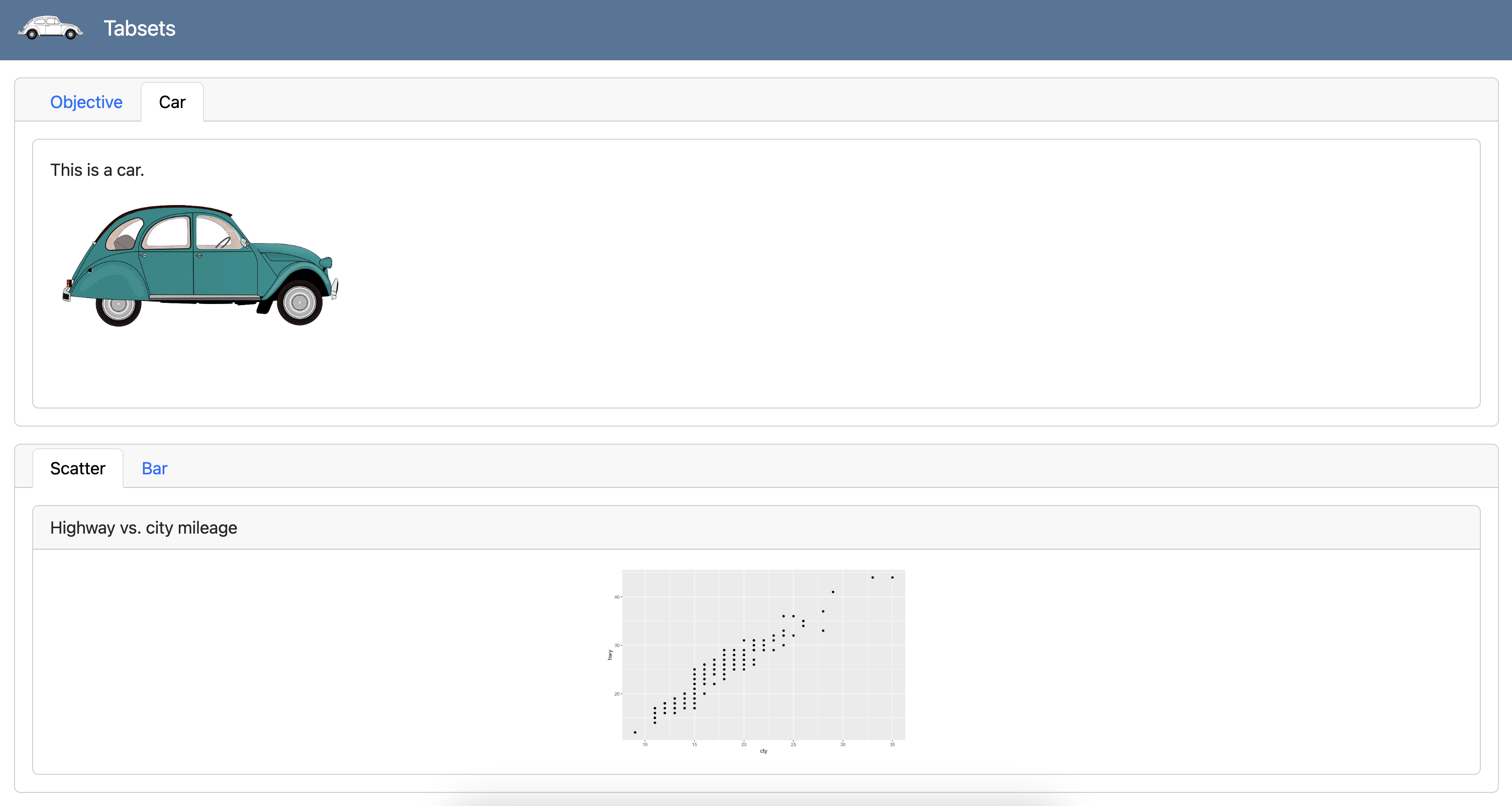
Tabsets
Each card within a row/column or each row/column within another becomes a tab:
dashboard-r.qmd
---
title: "Tabsets"
format:
dashboard:
logo: images/beetle.png
---
```{r}
library(ggplot2)
```
## Overview {.tabset}
### Objective
This dashboard summarizes an illuminating analysis of fuel economy of cars.
### Car
This is a car.
{fig-alt="Illustration of a teal color car." width="299"}
## Plots {.tabset}
### Scatter
```{r}
#| title: Highway vs. city mileage
ggplot(mpg, aes(x = cty, y = hwy)) +
geom_point()
```
### Bar
```{r}
#| title: Drive types
ggplot(mpg, aes(x = drv)) +
geom_bar()
```
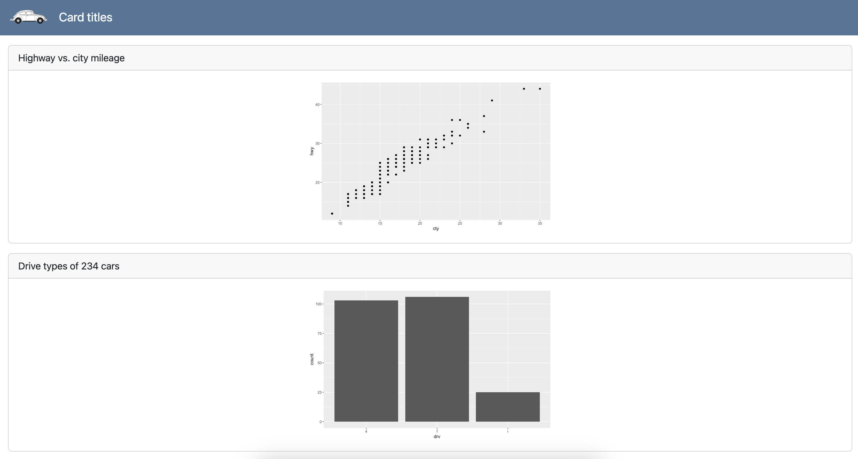
Card titles
dashboard-r.qmd
---
title: "Card titles"
format:
  dashboard:
    logo: images/beetle.png
---

```{r}
library(ggplot2)
```

```{r}
#| title: Highway vs. city mileage
ggplot(mpg, aes(x = cty, y = hwy)) +
  geom_point()
```

```{r}
n_cars <- nrow(mpg)

cat("title=", "Drive types of", n_cars, "cars")

ggplot(mpg, aes(x = drv)) +
  geom_bar()
```
Pop quiz!
Which of the following cells will become a card in a dashboard?

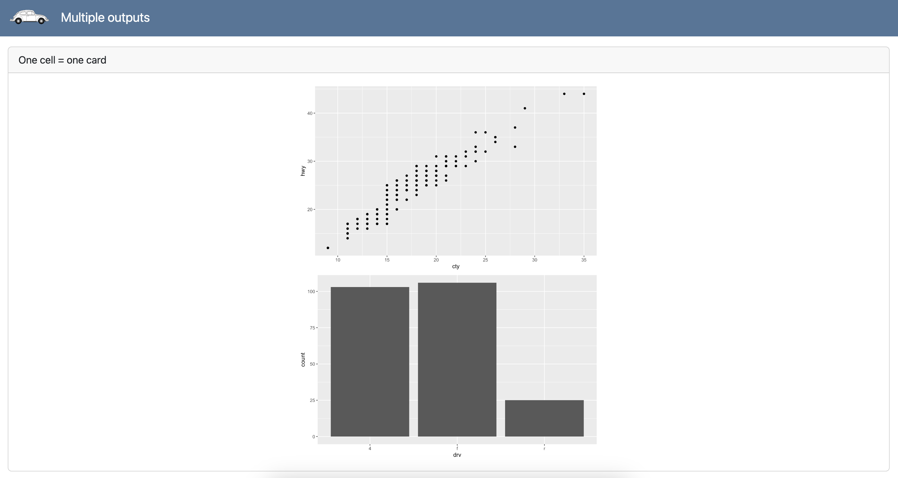
Multiple outputs
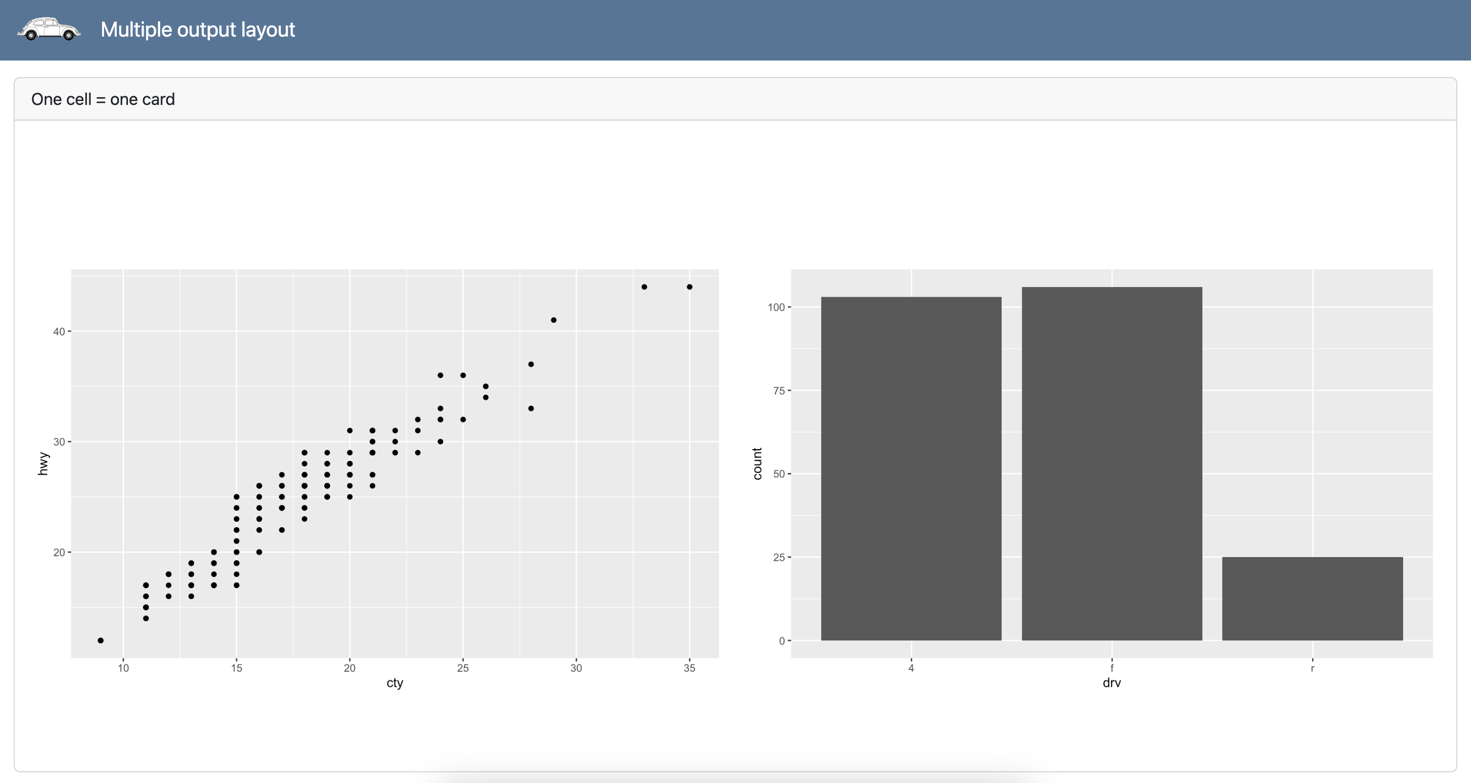
Multiple output layout
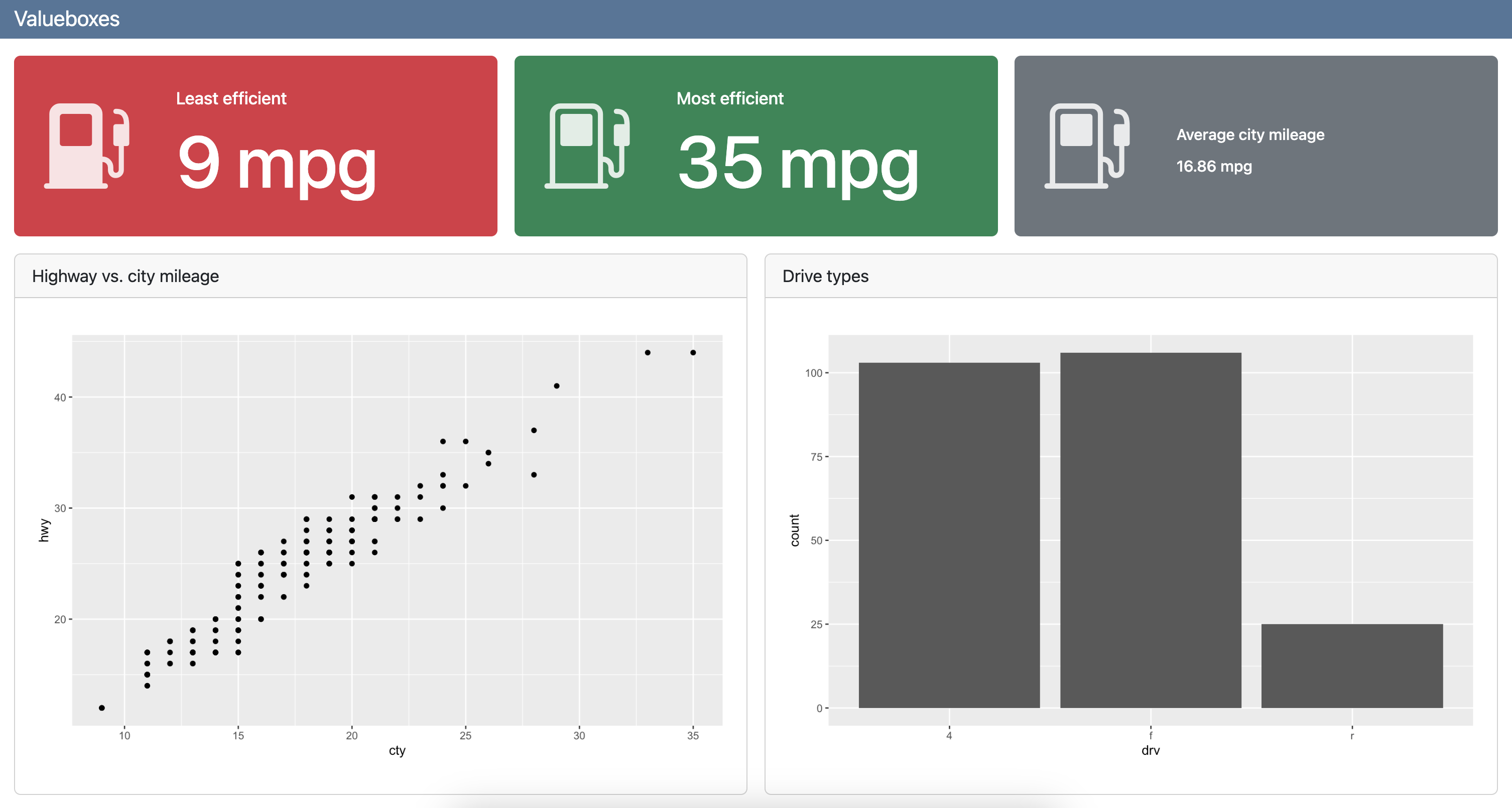
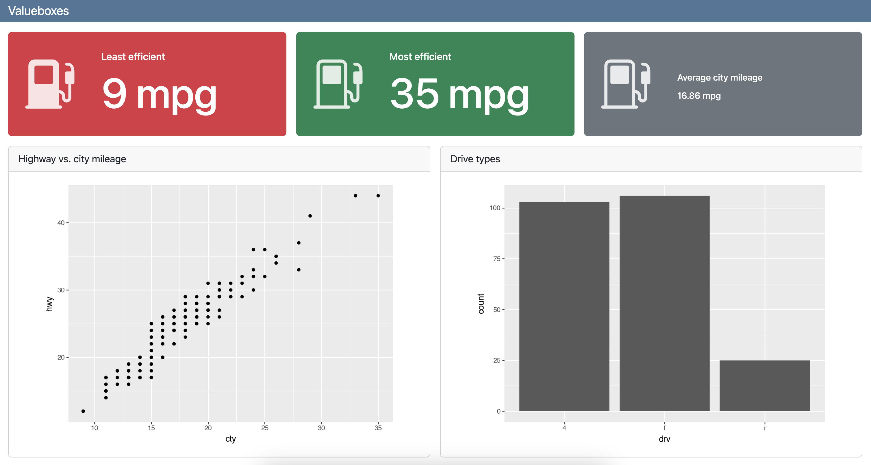
Value boxes
dashboard-r.qmd
---
title: "Valueboxes"
format: dashboard
---

```{r}
library(ggplot2)
library(dplyr)
```

## Value boxes {height="25%"}

```{r}
#| label: calculate-values
lowest_mileage_cty <- mpg |>
  filter(cty == min(cty)) |>
  distinct(cty) |>
  pull(cty)

highest_mileage_cty <- mpg |>
  filter(cty == max(cty)) |>
  distinct(cty) |>
  pull(cty)

rounded_mean_city_mileage <- mpg |>
  summarize(round(mean(cty), 2)) |>
  pull()
```

```{r}
#| content: valuebox
#| title: "Least efficient"
#| icon: fuel-pump-fill
#| color: danger
list(
  value = paste(lowest_mileage_cty, "mpg")
)
```

```{r}
#| content: valuebox
#| title: "Most efficient"
list(
  icon = "fuel-pump",
  color = "success",
  value = paste(highest_mileage_cty, "mpg")
)
```

::: {.valuebox icon="fuel-pump" color="secondary"}
Average city mileage

`{r} rounded_mean_city_mileage` mpg
:::

## Plots {height="75%"}

```{r}
#| title: Highway vs. city mileage
ggplot(mpg, aes(x = cty, y = hwy)) +
  geom_point()
```

```{r}
#| title: Drive types
ggplot(mpg, aes(x = drv)) +
  geom_bar()
```
Value boxes
dashboard-py.qmd
---
title: "Valueboxes"
format: dashboard
---

```{python}
from plotnine import ggplot, aes, geom_point, geom_bar
from plotnine.data import mpg
```

## Value boxes {height="25%"}

```{python}
#| label: calculate-values
lowest_mileage_index = mpg['cty'].idxmin()
lowest_mileage_car = mpg.iloc[lowest_mileage_index]
lowest_mileage_cty = mpg.loc[lowest_mileage_index, 'cty']

highest_mileage_index = mpg['cty'].idxmax()
highest_mileage_car = mpg.iloc[highest_mileage_index]
highest_mileage_cty = mpg.loc[highest_mileage_index, 'cty']

mean_city_mileage = mpg['cty'].mean()
rounded_mean_city_mileage = round(mean_city_mileage, 2)
```

```{python}
#| content: valuebox
#| title: "Least efficient"
#| icon: fuel-pump-fill
#| color: danger
dict(
  value = str(f"{lowest_mileage_cty} mpg")
)
```

```{python}
#| content: valuebox
#| title: "Most efficient"
dict(
  icon = "fuel-pump",
  color = "success",
  value = str(f"{highest_mileage_cty} mpg")
)
```

::: {.valuebox icon="fuel-pump" color="secondary"}
Average city mileage

`{python} str(rounded_mean_city_mileage)` mpg
:::

## Plots {height="75%"}

```{python}
#| title: Highway vs. city mileage
(
    ggplot(mpg, aes(x = "cty", y = "hwy"))
    + geom_point()
)
```

```{python}
#| title: Drive types
(
    ggplot(mpg, aes(x = "drv"))
    + geom_bar()
)
```
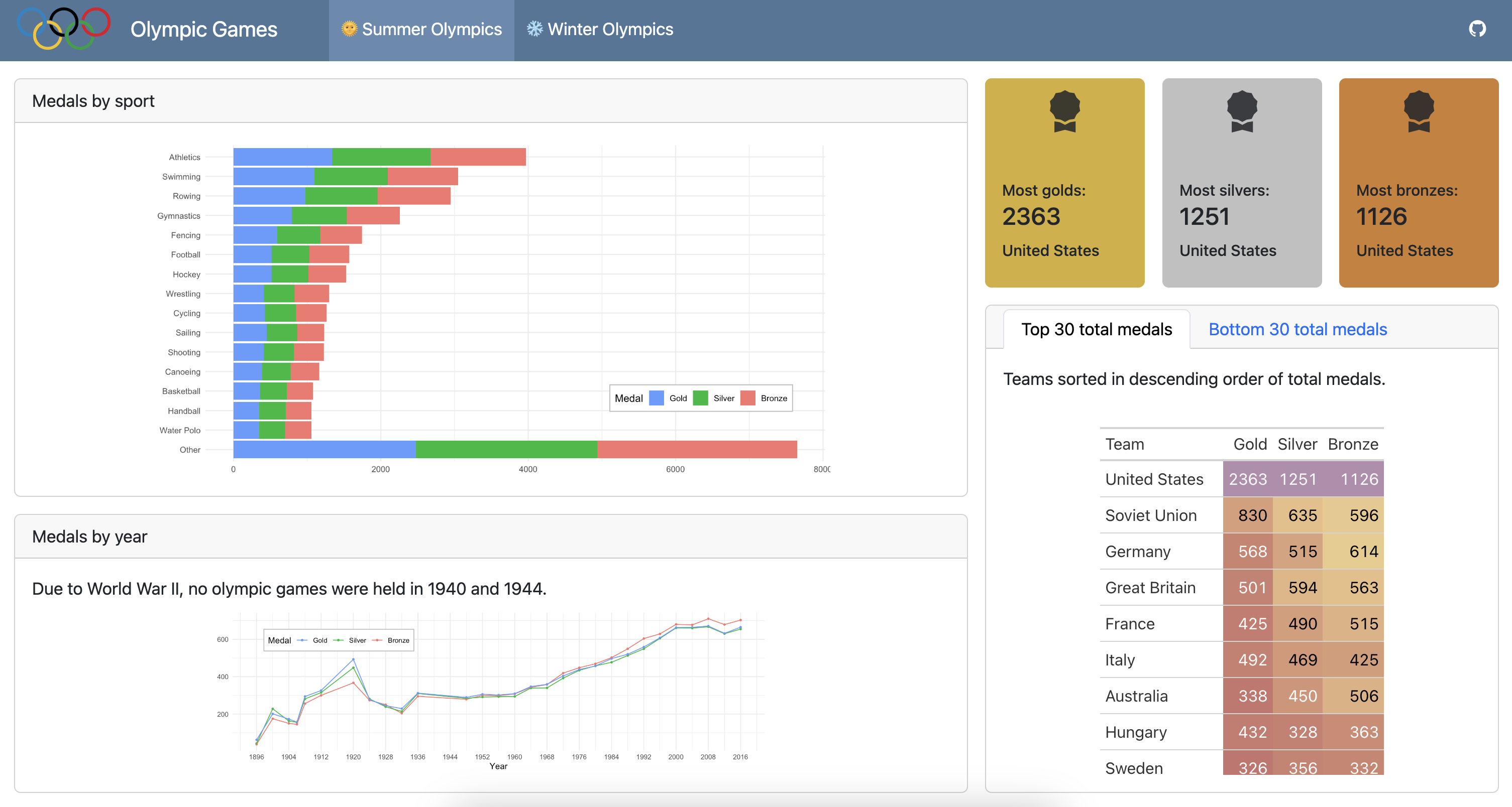
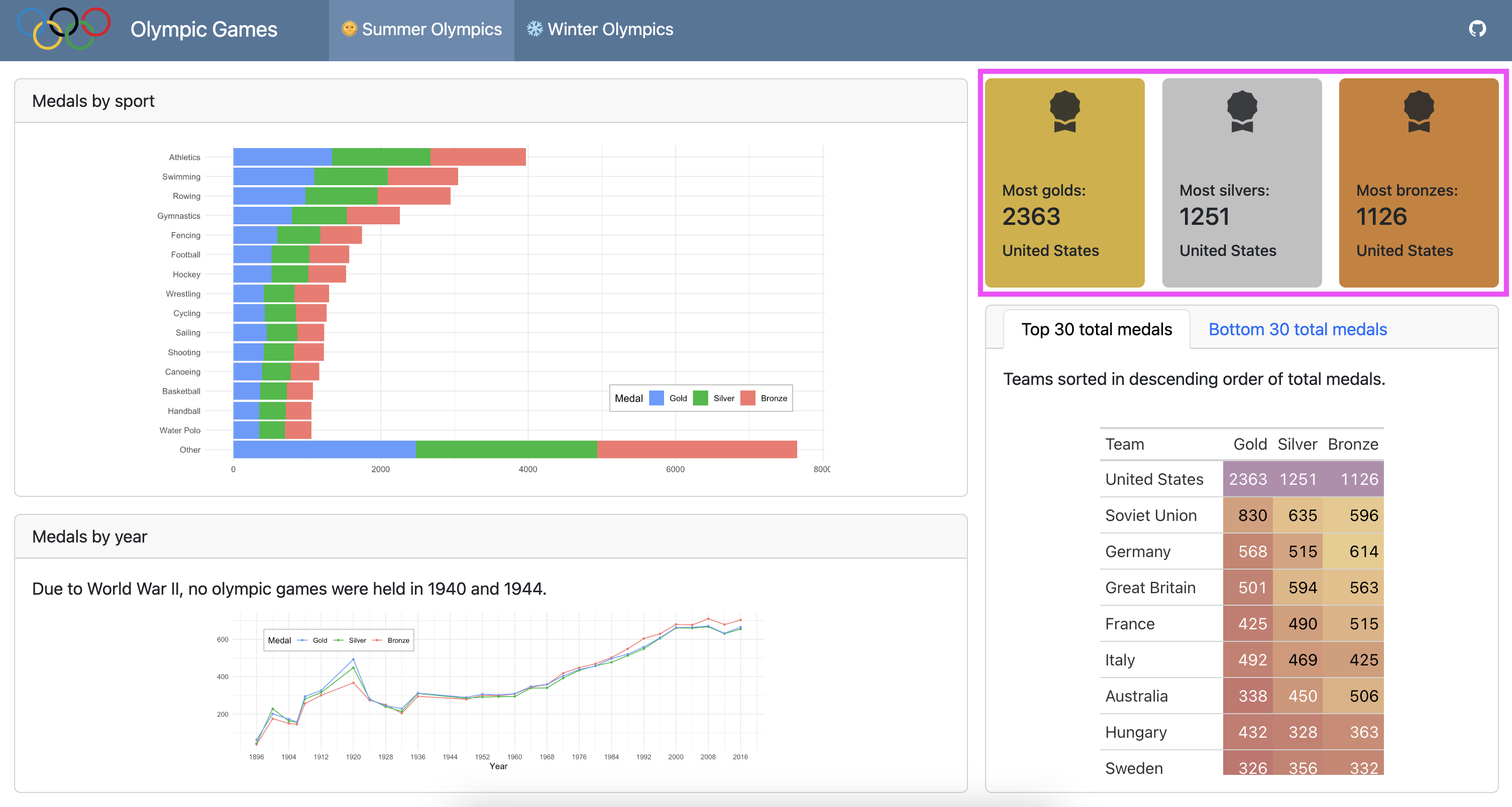
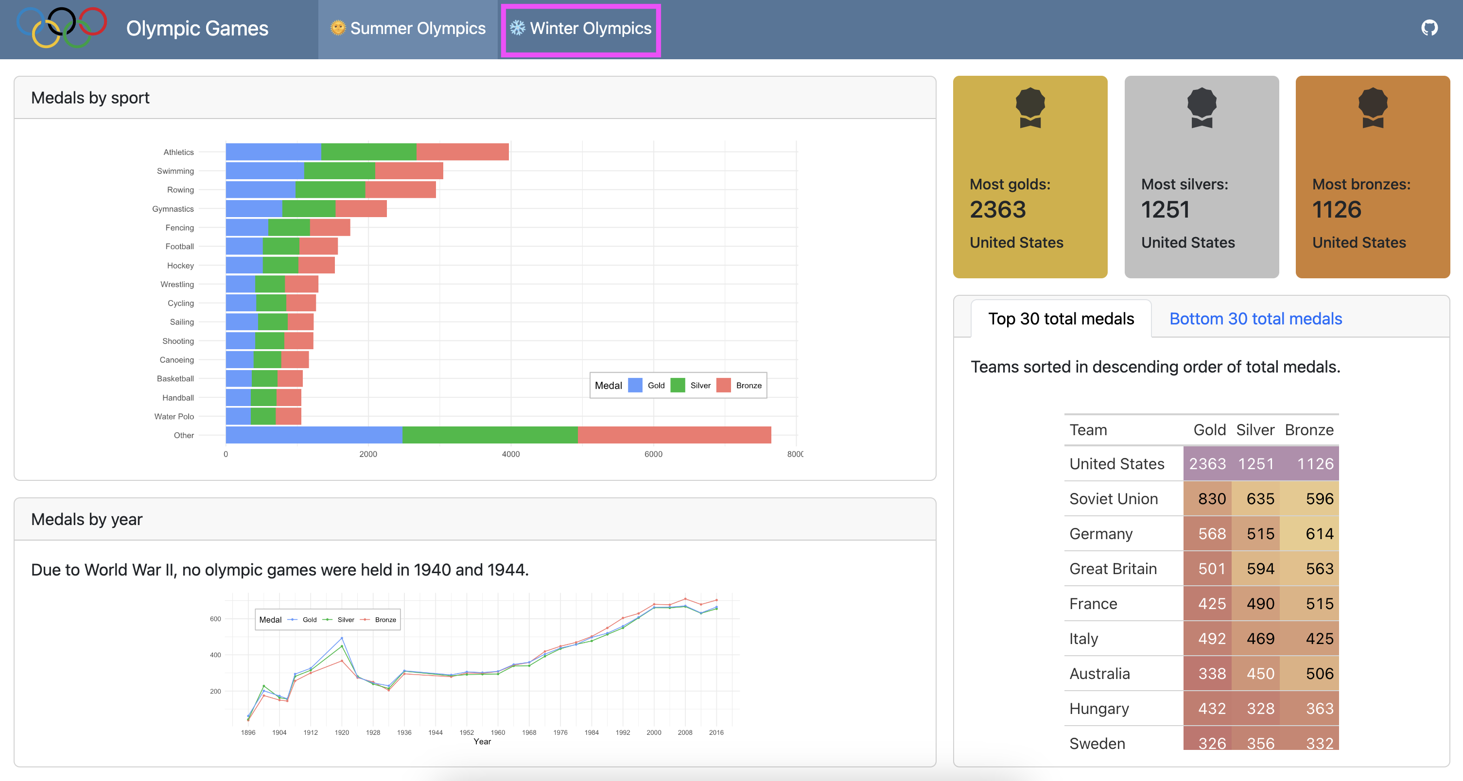
Goal
Your goal is to create a dashboard that looks like the following:
Step 1
- Add two pages - one for Summer Olympics and one for Winter Olympics.
- Duplicate existing dashboard content for the two types of olympic games with subsets of data from the corresponding season.
05:00
Step 2
In the Summer Olympics page:
- Make the columns 65% (first) and 35% (second) of width of the dashboard.
- Divide the first column into rows of 60% (first) and 40% (second) of height of the dashboard.
- In the second row of the first column, combine markdown text about cancelled olympic games with the medals by year plot in the same cell.
05:00
Step 3
In the Summer Olympics page:
- Divide the second column into rows of 25% (first) and 75% (second) of height of the dashboard.
- In the second row of the second column, create tables (using gt for R or great_tables for Python) of top 30 and bottom 30 total medals by team, sorted in descending order for the top 30 and ascending order for the bottom 30 total medals, and add color to the table based on data values.
- Place these tables in tabsets with descriptive text about table content in the same card/tab.
10:00
Step 4
In the first row of the second column of the Summer Olympics page, add value boxes for highest numbers of gold, silver, and bronze medals with appropriate color for each medal and using the award-fill icon.
10:00
Step 5
Duplicate dashboard content for the Winter Olympics page, share your results with your neighbor, and discuss approaches for not repeating yourself in your code.
05:00
![]()