Theming and styling
Build-a-Dashboard Workshop
2024-08-12
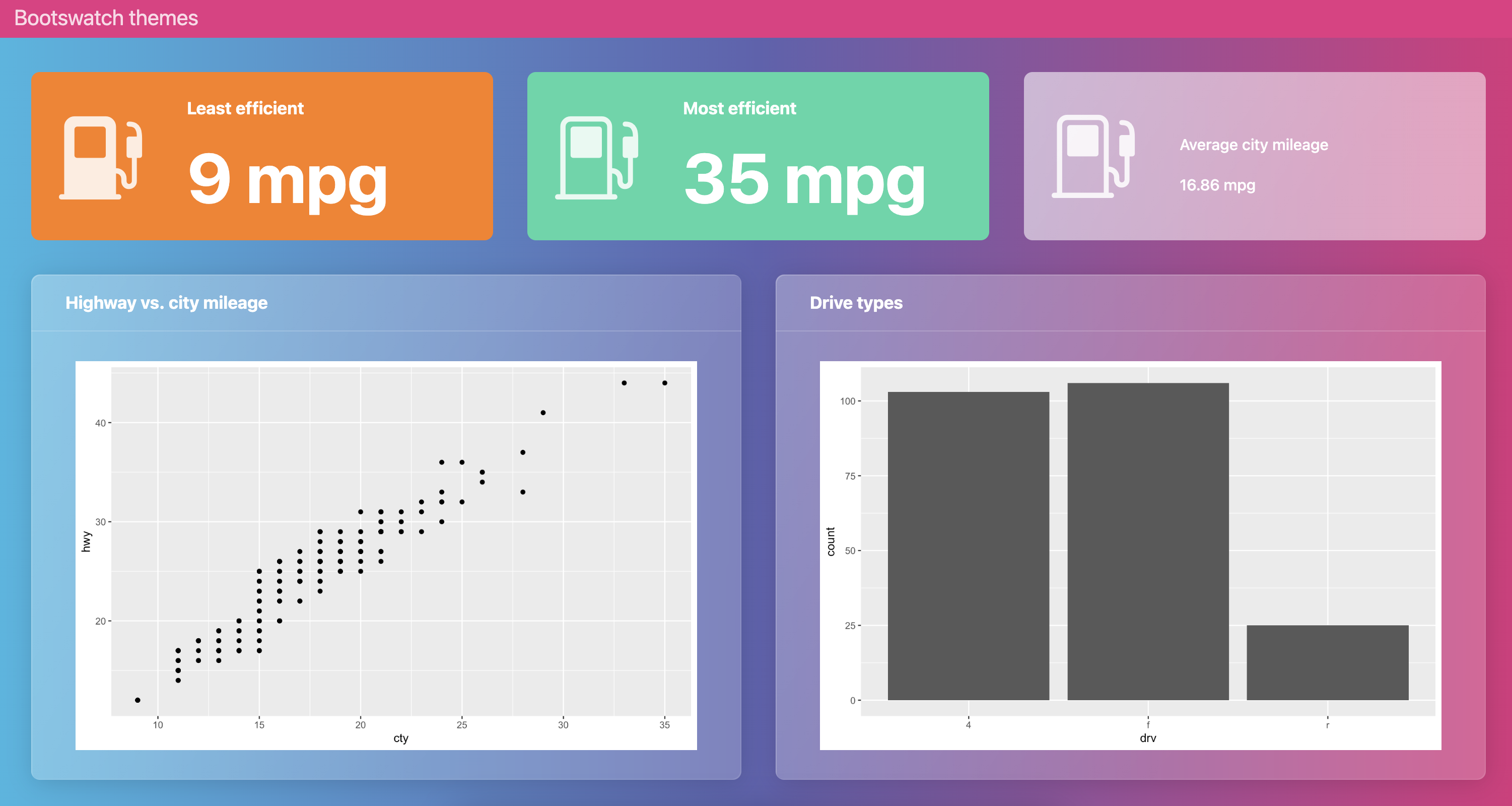
Bootswatch themes
dashboard-r.qmd
---
title: "Bootswatch themes"
format:
  dashboard:
    theme: quartz
---

```{r}
library(ggplot2)
library(dplyr)
```

## Value boxes {height="25%"}

```{r}
#| label: calculate-values
lowest_mileage_cty <- mpg |>
  filter(cty == min(cty)) |>
  distinct(cty) |>
  pull(cty)

highest_mileage_cty <- mpg |>
  filter(cty == max(cty)) |>
  distinct(cty) |>
  pull(cty)

rounded_mean_city_mileage <- mpg |>
  summarize(round(mean(cty), 2)) |>
  pull()
```

```{r}
#| content: valuebox
#| title: "Least efficient"
#| icon: fuel-pump-fill
#| color: danger
list(
  value = paste(lowest_mileage_cty, "mpg")
)
```

```{r}
#| content: valuebox
#| title: "Most efficient"
list(
  icon = "fuel-pump",
  color = "success",
  value = paste(highest_mileage_cty, "mpg")
)
```

::: {.valuebox icon="fuel-pump" color="secondary"}
Average city mileage

`{r} rounded_mean_city_mileage` mpg
:::

## Plots {height="75%"}

```{r}
#| title: Highway vs. city mileage
ggplot(mpg, aes(x = cty, y = hwy)) +
  geom_point()
```

```{r}
#| title: Drive types
ggplot(mpg, aes(x = drv)) +
  geom_bar()
```
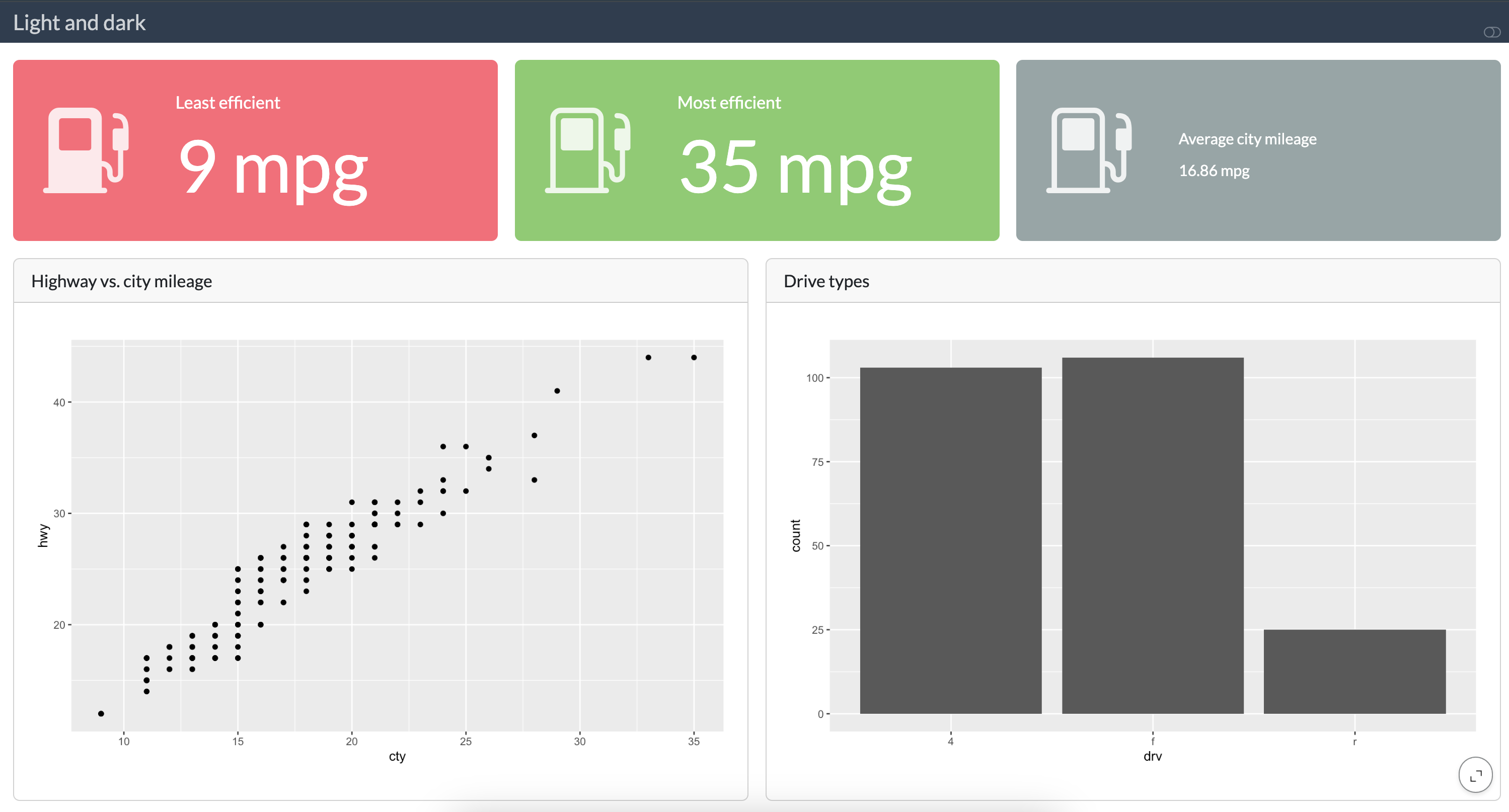
Light mode
dashboard-r.qmd
---
title: "Light and dark"
format:
  dashboard:
    theme:
      light: flatly
      dark: darkly
---

```{r}
library(ggplot2)
library(dplyr)
```

## Value boxes {height="25%"}

```{r}
#| label: calculate-values
lowest_mileage_cty <- mpg |>
  filter(cty == min(cty)) |>
  distinct(cty) |>
  pull(cty)

highest_mileage_cty <- mpg |>
  filter(cty == max(cty)) |>
  distinct(cty) |>
  pull(cty)

rounded_mean_city_mileage <- mpg |>
  summarize(round(mean(cty), 2)) |>
  pull()
```

```{r}
#| content: valuebox
#| title: "Least efficient"
#| icon: fuel-pump-fill
#| color: danger
list(
  value = paste(lowest_mileage_cty, "mpg")
)
```

```{r}
#| content: valuebox
#| title: "Most efficient"
list(
  icon = "fuel-pump",
  color = "success",
  value = paste(highest_mileage_cty, "mpg")
)
```

::: {.valuebox icon="fuel-pump" color="secondary"}
Average city mileage

`{r} rounded_mean_city_mileage` mpg
:::

## Plots {height="75%"}

```{r}
#| title: Highway vs. city mileage
ggplot(mpg, aes(x = cty, y = hwy)) +
  geom_point()
```

```{r}
#| title: Drive types
ggplot(mpg, aes(x = drv)) +
  geom_bar()
```
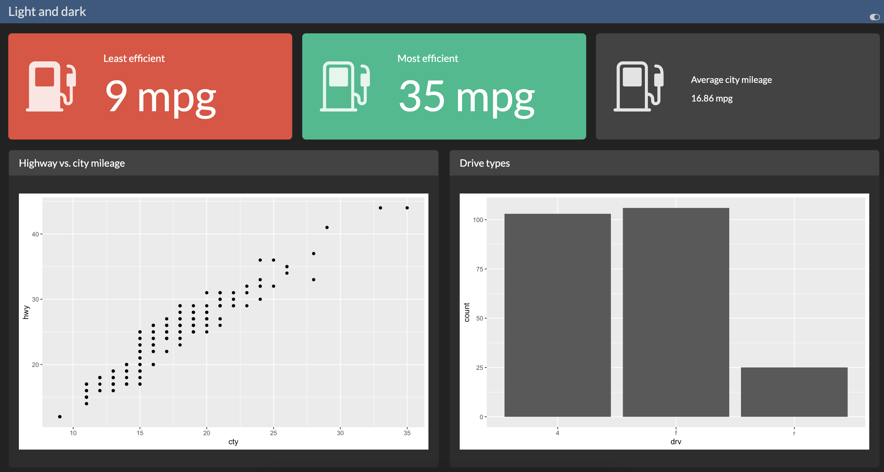
Dark mode
dashboard-r.qmd
---
title: "Light and dark"
format:
  dashboard:
    theme:
      light: flatly
      dark: darkly
---

```{r}
library(ggplot2)
library(dplyr)
```

## Value boxes {height="25%"}

```{r}
#| label: calculate-values
lowest_mileage_cty <- mpg |>
  filter(cty == min(cty)) |>
  distinct(cty) |>
  pull(cty)

highest_mileage_cty <- mpg |>
  filter(cty == max(cty)) |>
  distinct(cty) |>
  pull(cty)

rounded_mean_city_mileage <- mpg |>
  summarize(round(mean(cty), 2)) |>
  pull()
```

```{r}
#| content: valuebox
#| title: "Least efficient"
#| icon: fuel-pump-fill
#| color: danger
list(
  value = paste(lowest_mileage_cty, "mpg")
)
```

```{r}
#| content: valuebox
#| title: "Most efficient"
list(
  icon = "fuel-pump",
  color = "success",
  value = paste(highest_mileage_cty, "mpg")
)
```

::: {.valuebox icon="fuel-pump" color="secondary"}
Average city mileage

`{r} rounded_mean_city_mileage` mpg
:::

## Plots {height="75%"}

```{r}
#| title: Highway vs. city mileage
ggplot(mpg, aes(x = cty, y = hwy)) +
  geom_point()
```

```{r}
#| title: Drive types
ggplot(mpg, aes(x = drv)) +
  geom_bar()
```
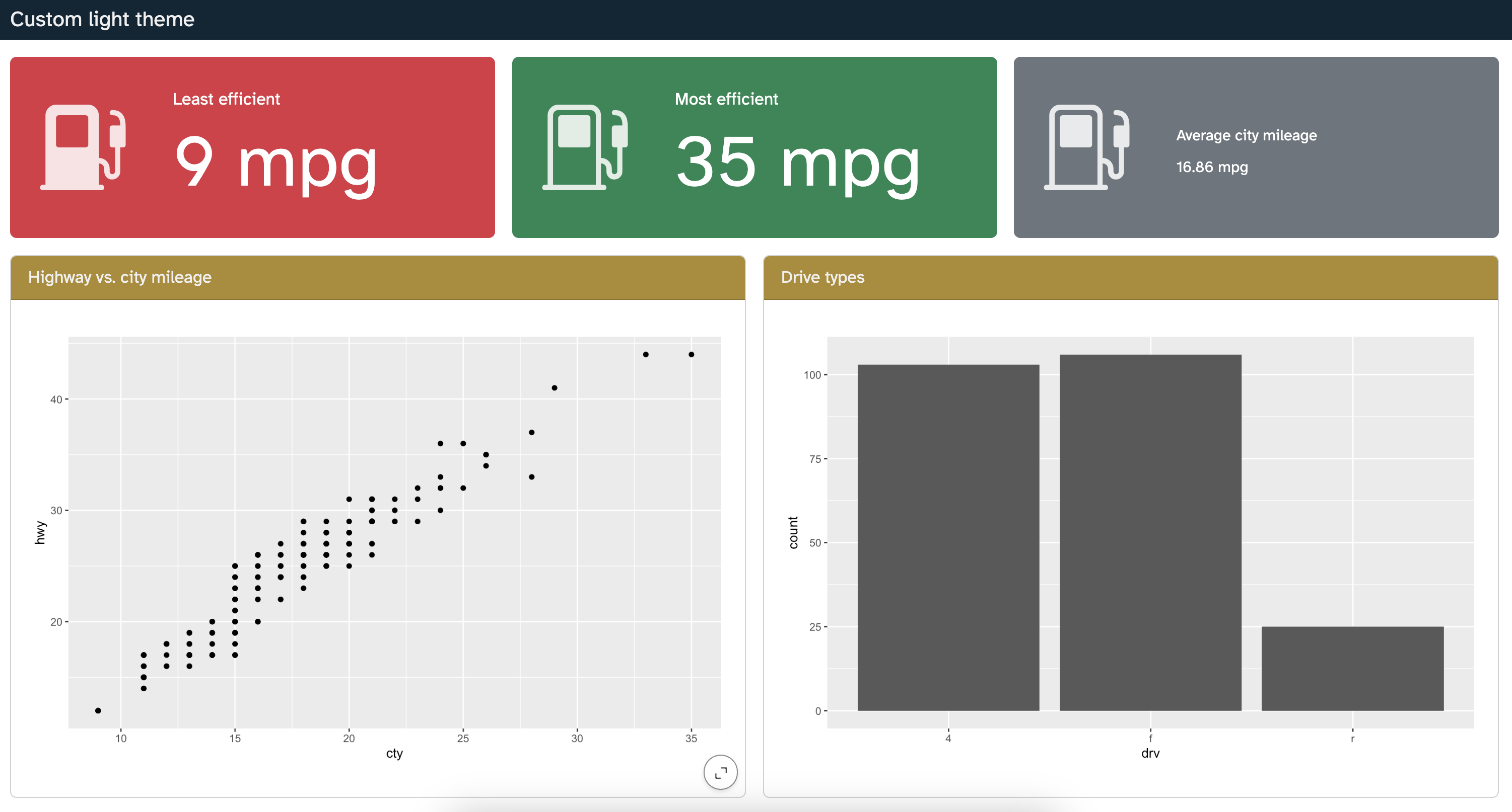
Custom light SCSS
dashboard-r.qmd
---
title: "Custom light theme"
format:
  dashboard:
    theme: style/custom-light.scss
---

```{r}
library(ggplot2)
library(dplyr)
```

## Value boxes {height="25%"}

```{r}
#| label: calculate-values
lowest_mileage_cty <- mpg |>
  filter(cty == min(cty)) |>
  distinct(cty) |>
  pull(cty)

highest_mileage_cty <- mpg |>
  filter(cty == max(cty)) |>
  distinct(cty) |>
  pull(cty)

rounded_mean_city_mileage <- mpg |>
  summarize(round(mean(cty), 2)) |>
  pull()
```

```{r}
#| content: valuebox
#| title: "Least efficient"
#| icon: fuel-pump-fill
#| color: danger
list(
  value = paste(lowest_mileage_cty, "mpg")
)
```

```{r}
#| content: valuebox
#| title: "Most efficient"
list(
  icon = "fuel-pump",
  color = "success",
  value = paste(highest_mileage_cty, "mpg")
)
```

::: {.valuebox icon="fuel-pump" color="secondary"}
Average city mileage

`{r} rounded_mean_city_mileage` mpg
:::

## Plots {height="75%"}

```{r}
#| title: Highway vs. city mileage
ggplot(mpg, aes(x = cty, y = hwy)) +
  geom_point()
```

```{r}
#| title: Drive types
ggplot(mpg, aes(x = drv)) +
  geom_bar()
```
Customizing Bootswatch themes
dashboard-r.qmd
---
title: "Sandstone + Custom light theme"
format:
  dashboard:
    theme:
      - sandstone
      - style/custom-light.scss
---

```{r}
library(ggplot2)
library(dplyr)
```

## Value boxes {height="25%"}

```{r}
#| label: calculate-values
lowest_mileage_cty <- mpg |>
  filter(cty == min(cty)) |>
  distinct(cty) |>
  pull(cty)

highest_mileage_cty <- mpg |>
  filter(cty == max(cty)) |>
  distinct(cty) |>
  pull(cty)

rounded_mean_city_mileage <- mpg |>
  summarize(round(mean(cty), 2)) |>
  pull()
```

```{r}
#| content: valuebox
#| title: "Least efficient"
#| icon: fuel-pump-fill
#| color: danger
list(
  value = paste(lowest_mileage_cty, "mpg")
)
```

```{r}
#| content: valuebox
#| title: "Most efficient"
list(
  icon = "fuel-pump",
  color = "success",
  value = paste(highest_mileage_cty, "mpg")
)
```

::: {.valuebox icon="fuel-pump" color="secondary"}
Average city mileage

`{r} rounded_mean_city_mileage` mpg
:::

## Plots {height="75%"}

```{r}
#| title: Highway vs. city mileage
ggplot(mpg, aes(x = cty, y = hwy)) +
  geom_point()
```

```{r}
#| title: Drive types
ggplot(mpg, aes(x = drv)) +
  geom_bar()
```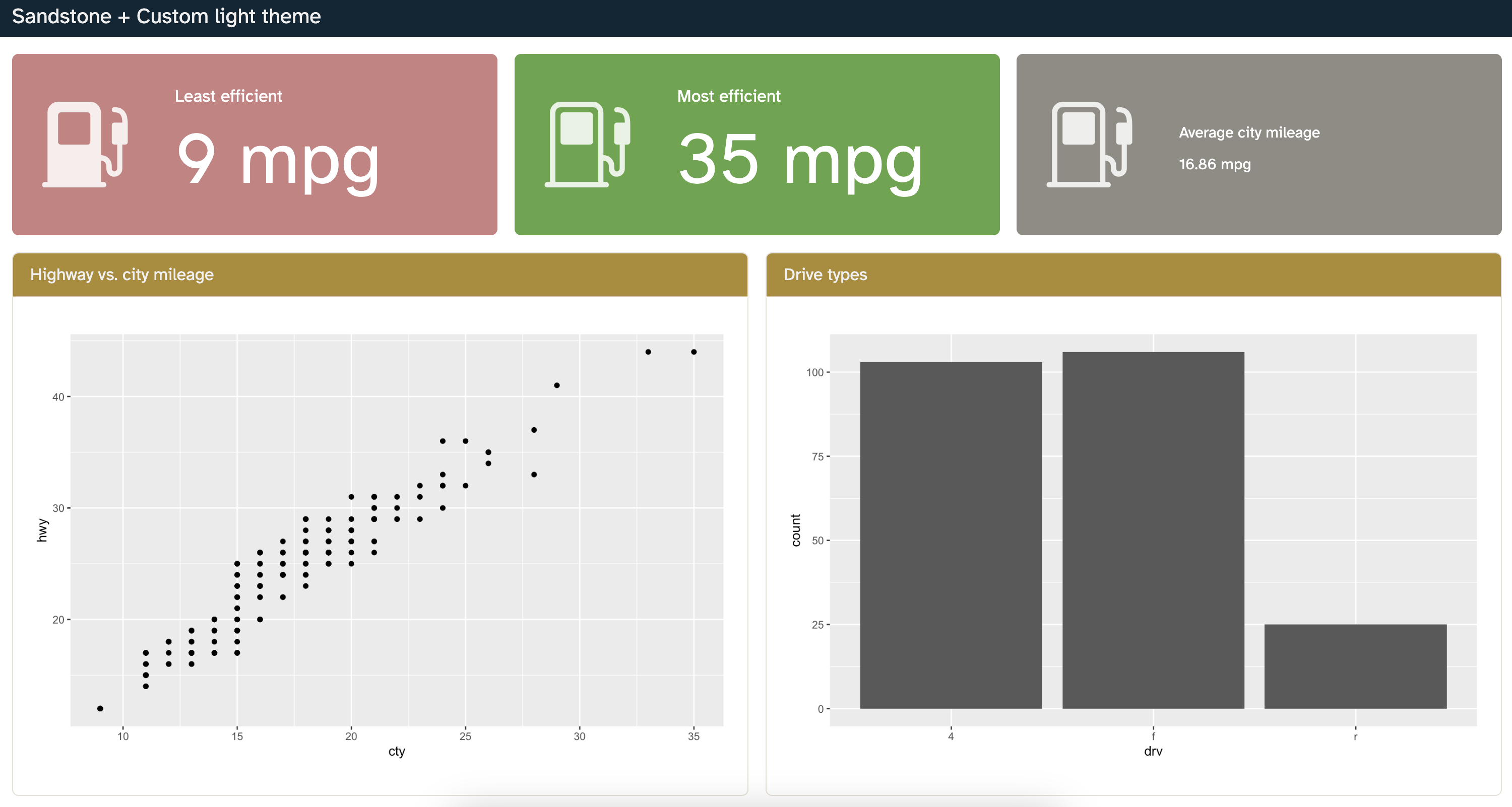
Goal
Your goal is to create a dashboard that looks like the following:
Step 1
- Update the theme to the appropriate Bootswatch theme.
- Render the dashboard and identify what other aspects of the dashboard theme and cell outputs should be modified.
Tip
Work with your neighbor if you’re having difficulty finding which theme to use.
05:00
Step 2
Add an SCSS file for custom styling and use it to augment the Bootswatch theme to get dashboard theme elements as close to the final goal as you can.
Tip
Use a tool like the Digital Color Picker to identify colors to be set.
10:00
Step 3
Polish your plots to get them as close to the final goal as you can.
10:00
Look forward to…
These may or may not happen in the near / not-so-near future, but you might want to follow them:
_brand.yml: https://github.com/quarto-dev/quarto-cli/issues/10249Support for auto theming in quarto with the thematic R package: https://github.com/rstudio/thematic/issues/125
Improve the HTML Theming documentation page: https://github.com/quarto-dev/quarto-cli/issues/8654
![]()