CSS / SCSS

what is CSS

Cascading Style Sheets is a style sheet language used for specifying the presentation and styling of a document

HTML syntax in 5 minutes

HTML (HyperText Markup Language) is built on tags like

<html></html> and <div></div>

Tags can be nested <div><div></div><div></div></div>

<div>
  <div></div>
  <div></div>
</div>

HTML structure

Is built around 3 main tags:

  • <html>
  • <head>
  • <body>
<!DOCTYPE html> 
<html>
  <head>
    <link rel="stylesheet" href="styles.css">
  </head>

  <body>
    <h1>
      I'm a header
    </h1>
    <p>
      Here is some text in a paragraph
    </p>
  </body>
</html>

HTML head

contains:

  • meta information
  • style sheets
  • and sometimes scripts (mostly javascript)

95% of this will be handled by Quarto for you

HTML body


Contains everything else

Common HTML tags

Headers

<h1>, <h2>, <h3>, <h4>, <h5>, <h6>

Paragraph

<p>

links

<a>

general div

<div>

HTML attributes

All HTML elements can have attributes

They provide additional information about the elements

Are always specified at the start-tag

Done by using name-value pairs: name="value"


Classes and ids

<h1 class="title" id="special-title">

Images source attribute

<img src="img_girl.jpg">

Where is the code for styling?

  • inline style

<h1 style="color:red;">Welcome to styling 101</h1>

  • style.css

Loaded in <head>

<link rel="stylesheet" href="my-awesome-style.css">

How we use CSS

In its simplest form, we need to define 2 things


selectors

What needs to be styled


Attributes

How it should be styled

Selectors

by tags

h1 {

}

by class

.important {

}

by id

#title-text {

}

Combining selectors

All h1 and all h2

h1, h2 {

}

All headers

h1, h2, h3, h4, h5, h6 {

}

Combining selectors

All span in p

p span {

}

Only <span>friend</span> would be affected

<span>Conversation</span>
<p>
hello there my 
<span>friend</span>
how are you doing
</p>

Combining selectors

all h2 1 level deep in .happy

.happy > h2

Only the first would be affected

<div class="happy">
  <h2>header</h2>
  <div>
    <h2>header</h2>
  </div>
</div>

Combining selectors

all h2 elements with .happy class

h2.happy

Only the second h2 would be affected

<div class="happy">
  <h2>header</h2>
  <div>
    <h2 class="happy">header</h2>
  </div>
</div>

Your turn

Open styles.scss file and do the following:

  • Change styling of h1 and h2 elements
    • at least change the color
  • Change styling of text (p elements)
  • Change styling of only the subtitle of the front page
  • Change styling of buttons on front page
05:00

Selectors References

As with anything web related, there are tons of resources online

https://www.w3schools.com/cssref/css_selectors.php

https://www.w3schools.com/css/css_selectors.asp

https://developer.mozilla.org/en-US/docs/Web/CSS/CSS_selectors

https://www.freecodecamp.org/news/css-selectors-cheat-sheet-for-beginners/

https://www.w3.org/TR/CSS21/selector.html%23id-selectors

Pseudo-classes

Modifies existing classes

User action

  • :hover
  • :active
a.navbar:hover {
  color: blue;
}

a.navbar:active {
  color: darkblue;
}

Pseudo-classes - Tree bases

Can do math to style only some elements

  • :first-child
  • :nth-of-type
p:first-child {
  border: 2px solid blue;
}

p:nth-of-type(2n+1) {
  border: 2px solid orange;
}

Pseudo-classes - Fancy selectors

Outside scope, but shows what can be done if you care to explore it

  • :has()

if h1 has a sibling h2 then set the bottom margin of h1 to 0.25rem

h1:has(+ h2) {
  margin-bottom: 0.25rem;
}

When the container has a child card hovered, select all the cards that aren’t hovered.

.card-list:has(.card:hover) .card:not(:hover) {
  filter: blur(4px)
}

Your turn

Open styles.scss file and do the following:

  1. Find an element that would benefit from having a pseudo-class
    • :hover is a safe choice, but not the only one
  2. Apply pseudo-class to said element
02:00

Cascading

Stylesheets cascade — at a very simple level, this means that the origin, the cascade layer, and the order of CSS rules matter. When two rules from the same cascade layer apply and both have equal specificity, the one that is defined last in the stylesheet is the one that will be used.

h1 looses to h1.title-class because h1.title-class is more specific

Attributes

The attributes are instructions on how elements should look and behave.

  • How things look
    • colors
    • sizes
    • border lines
    • etc
  • How elements are positioned to other elements
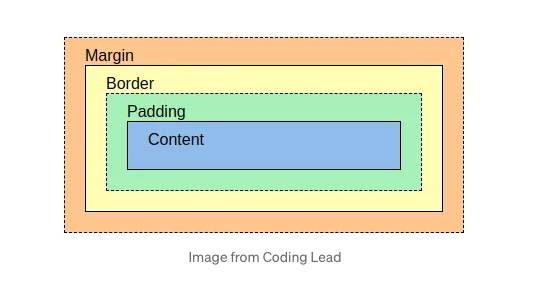
    • Layout

Layout

Layout

  • Content - The content of the box, where text and images appear
  • Padding - Clears an area around the content. The padding is transparent
  • Border - A border that goes around the padding and content
  • Margin - Clears an area outside the border. The margin is transparent

Layout - content

Size of the content is set using height and width

Values are lengths

  • 10px
  • 2em

or percentages

  • 40%
  • 100%

Your turn

Open styles.scss file and do the following:

  1. Find an element
    • images or text
  2. Change the height and width
02:00

Layout - padding

you can set the about of padding with

  • padding or

  • padding-bottom, padding-left, padding-right, and padding-top

Values are lengths or percentages.

padding is used as a shorthand

Layout - padding

Following are equivalent

h1 {
  padding: 10px;
}
h1 {
  padding-bottom: 10px;
  padding-left: 10px;
  padding-right: 10px;
  padding-top: 10px;
  }

Layout - padding

Following are equivalent

h1 {
  padding: 10px 20px;
}
h1 {
  padding-bottom: 10px;
  padding-left: 20px;
  padding-right: 20px;
  padding-top: 10px;
  }

Layout - padding

Following are equivalent

h1 {
  padding: 10px 20px 30px;
}
h1 {
  padding-bottom: 30px;
  padding-left: 20px;
  padding-right: 20px;
  padding-top: 10px;
  }

Layout - padding

Following are equivalent (clock-wise)

h1 {
  padding: 10px 20px 30px 40px;
}
h1 {
  padding-bottom: 30px;
  padding-left: 40px;
  padding-right: 20px;
  padding-top: 10px;
  }

Your turn

Continue with element from before

  1. Change the 4 values of padding and see what happens
02:00

Layout - border

Are styled as

h2 {
  border: 2px solid #32a1ce;
}
h2 {
  border-color: #32a1ce;
  border-style: solid;
  border-width: 2px;
}

Layout - margin

works the same as padding

h1 {
  margin: 10px 20px 30px;
}
h1 {
  margin-bottom: 30px;
  margin-left: 20px;
  margin-right: 20px;
  margin-top: 10px;
  }

Your turn

Continue with element from before

  1. Change the 4 values of margin and see what happens
02:00

CSS grid

Slightly outside scope, but is useful to know that it exists


Elements are styled as columns and rows


A complete Guide to CSS Grid

CSS Grid Generator

CSS flexbox

Slightly outside scope, but is useful to know that it exists

A flex container expands items to fill available free space or shrinks them to prevent overflow.

A complete Guide to Flexbox

Absolute positioning

Setting

  • position: relative; to parent
  • position: absolute; to child

then set location using top, left, right, and bottom

<div style="position: relative;">
  <img style="position: absolute; left: 10%; top: 25%;">
</div>

Can be nice to use, but can be an anti-pattern if used too much

Centering in CSS

A common joke in programming

Has been solved for a while

http://howtocenterincss.com/

What is SASS/SCSS

SASS (CSS with superpowers), is an extension of CSS

SCSS is one of the syntaxes, the one we will use

Why use SASS?

  • CSS Compatible
  • Feature Rich
  • Mature

Why use SASS?

CSS but with variables, nested rules, mixins, functions and more


the SCSS file will compile to CSS which browsers understand

Quarto will do all of this for you

SASS variables

variables (much like in R and Python) are a way to store a value to use later, done to reduce repetition


using the syntax: $variable-name: value;

h2 {
  color: #32a1ce;
}
$favorite-blue: #32a1ce;

h2 {
  color: $favorite-blue;
}

Your turn

-Open styles.scss and

  • use a SASS variable to define h1 and h2 colors
  • consider what other things we could use variables for
03:00

SASS nested rules

syntactic way to organize your style sheets

h2 {
  color: #32a1ce;

  a {
    color: #055778;
  }
}
h2 {
  color: #32a1ce;
}

h2 a {
  color: #055778;
}

Can be a even better improvement wth the right IDE settings

SASS nested rules

Selector Combinators works too

h2 {
  color: #32a1ce;

  > a {
    color: #055778;
  }
}
h2 {
  color: #32a1ce;
}

h2 > a {
  color: #055778;
}

SASS nested rules

Add organization to styling

.speech {
  background-color: $theme-grey;
  padding: 1em;
  margin-bottom: 1em;
  border-radius: 15px;
  border-style: solid;
  border-width: 5px;

  img {
    margin-bottom: -0.5em;
    padding-right: 0.5em;
    transform: scaleX(-1);
  }

  &.right {
    text-align: right;


    img {
      padding-left: 0.5em;
      transform: scaleX(1);
    }
  }

  &.pink {
    background-color: $theme-pink;
    border-color: darken($theme-pink, 20%);
  }
  &.brown {
    background-color: $theme-brown;
    border-color: darken($theme-brown, 20%);
  }
  &.blue {
    background-color: $theme-blue;
    border-color: darken($theme-blue, 20%);
  }
  &.purple {
    background-color: $theme-purple;
    border-color: darken($theme-purple, 20%);
  }
}

Your turn

-Open styles.scss and

  • rewrite your existing styles to use nested rules
02:00

SASS mixins

Avoid duplication of style

@mixin padding-small {
  padding-bottom: 10px;
  padding-left: 20px;
  padding-right: 20px;
  padding-top: 10px;
}

h2 {
  @include padding-small;
  color: #32a1ce;
}

h3 {
  @include padding-small;
  color: #32cebc;
}

h4 {
  @include padding-small;
  color: #83ce32;
}
h2 {
  padding-bottom: 10px;
  padding-left: 20px;
  padding-right: 20px;
  padding-top: 10px;
  color: #32a1ce;
}

h3 {
  padding-bottom: 10px;
  padding-left: 20px;
  padding-right: 20px;
  padding-top: 10px;
  color: #32cebc;
}

h4 {
  padding-bottom: 10px;
  padding-left: 20px;
  padding-right: 20px;
  padding-top: 10px;
  color: #83ce32;
}

Your turn

-Open styles.scss and

  • use a SASS mixins to reduce complexity in your styles
02:00

SASS functions

Many different built-in functions

$favorite-blue: #32a1ce;

h2 {
  color: $favorite-blue;

  > a {
    color: darken($favorite-blue);
  }
}
h2 {
  color: #32a1ce;
}

h2 > a {
  color: #055778;
}

Your turn

-Open styles.scss and

  • use a SASS color function to make the colors of h1 and h2 different
03:00

Design principles

We will assume you have good content, and it is ordered appropriately with different pages and navigation


What principles can we employ to make the most out of your website


If the user thinks “I wonder which button to click”, something bad happened

What is its purpose?

When designing a website we have to keep the audience in mind

It all depends on the audience and how you want them to interact with it


academic websites will be different than business sites


Academic

Information

Business

Call to action

Hick’s Law

Every additional choice increases the time required to make a decision.


A reminder to keep it simple

Make it easy for your users to find what they want

Readding Patterns

F-shaped and Z-shaped


Make sure all content follows a natural order

Readding Patterns - headers and footers

Discussion:

Knowing what we know now, what elements are good to place in the header and footer?

Negative Space

You don’t need to fill all the screen real estate

we typically also have a limited text width for ease of reading

Negative Space

Negative Space

Consistent Design

We look at similarities and differences, if an element looks different than the rest, we are going to assume that it matters

using principled styling will alleviate many of these problems

Choosing colors

The colors can come from a lot of different places

  • corporate guidelines
  • you
  • from online inspiration (Pinterest)

Setting up a color theme

We can create a color palette in SASS by using a set of environment variables.

$theme-white: #FFFFFF;
$theme-black: #222222;
$theme-blue: #5538f8;
$theme-red: #df4747;

These will then be used throughout the

$link-color: $theme-blue;

$$sidebar-hl: lighten($theme-blue, 0.5);

Your turn

Open styles.scss then

  • find a color theme
  • add colors as SASS variables
  • Use SASS variables
05:00

Using color on websites

Be mindful when using colors

60-30-10 rule

60% - Primary color

  • typically background

30% - Secondary color

  • text and elements

10% - Accent color

  • highlights, buttons

60-30-10 deviations

As with all things, this is not a hard and fast rule.

you can use fewer or more colors

  • https://codegoda.io/

notice that they use their colors carefully and consistently

Choosing fonts

Use readable and web-friendly fonts

  • common fonts are by definition readable as they are familiar
  • fonts are designed to be used in different areas, optimize for web fonts
  • don’t pick too many fonts

Maintaining accessibility

What is web accessibility?

Web accessibility is the practice of creating websites that are usable for all visitors regardless of a disability or impairment. To fulfill web accessibility best practices, you must create a site that complies with certain design and development guidelines that ensure your site is set up to accommodate folks with disabilities. This ensures that all users have the same or similar experience regardless of ability.

Maintaining accessibility

How do we do it?

  • Avoid blinking/flashing content

  • Maintain high color contrast when needed

  • Add alt-text to elements

  • Ensure complete functionality via the keyboard

    • should be handled by Quarto

Your turn

Open styles.scss then

  • make temporary changes to the colors, sizes and fonts that would go against accessibility advice to see how the experience gets worse
04:00